
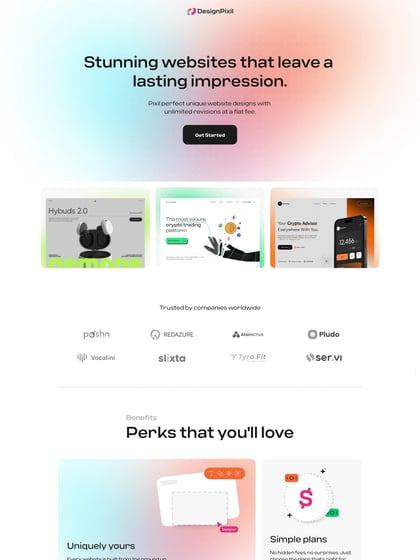
Web Card Design: Creating Clear, Clickable and Effective Cards
Web cards are compact interface elements that bring related content together in a neat, recognisable format. They appear across websites and apps, helping people scan information and choose what to explore next. A card might feature a product, an article, a service, an event or a team member.
Although cards may look simple, effective web card design takes more than placing text and an image inside a box. Each card needs to communicate its purpose quickly, work well on different screen sizes and make the next step clear.
What makes a web card?
A typical card combines a small number of related elements, such as:
- An image or illustration that helps identify the content
- A title that explains what the card is about
- A short description that adds useful context
- Supporting details, such as a price, date, category or rating
- A clear action, such as “Read more”, “View product” or “Book now”
Not every card needs every element. The best content depends on the card’s purpose and the needs of its audience.
Start with a clear purpose
Before designing a card, decide what it should help someone do. Is it meant to summarise an article, compare products or encourage a booking? A card with a defined purpose is easier to scan and less likely to become crowded.
Keep the content focused on one main idea. If a card contains several unrelated links, messages or actions, it can become difficult to understand. Consider using separate cards or a different layout instead.
Build a clear visual hierarchy
People often scan a page rather than read every word. Use size, spacing, colour and typography to show which information matters most. A title should usually stand out from supporting text, while secondary details should remain easy to find without competing for attention.
Keep headings concise and descriptions brief. If a card needs a long explanation, provide a short summary and link to a page with the full details.
Use images thoughtfully
Images can make cards more engaging and help people recognise their contents. Choose images that are relevant, clear and consistent in style. Where cards appear in a row or grid, use a consistent aspect ratio so the layout feels orderly.
Images should also be optimised so they load quickly. Add appropriate alternative text when an image conveys information; if it is purely decorative, it can be hidden from assistive technologies.
Make cards easy to use
Interactive cards should make it obvious what can be clicked or tapped. Use recognisable link or button styles, and provide visible hover and keyboard-focus states. Make sure the text and background have sufficient contrast.
If the whole card is clickable, ensure it has a clear accessible name and behaves like a link. Avoid placing several competing links inside one clickable card, as this can create confusing navigation. On touchscreens, make interactive areas large enough to use comfortably.
Design for different screen sizes
A card layout that works on a wide desktop screen may feel cramped on a mobile phone. Use responsive layouts that adjust the number of columns and the spacing between cards to suit the available space. Check that titles wrap neatly, images remain useful and actions are not pushed out of view.
It is also worth testing cards with longer titles and descriptions. Real content rarely fits perfectly into a design mock-up, so flexible layouts are generally more reliable than fixed heights.
Keep the design consistent
Consistent cards help people understand how a website is organised. Use a shared approach to spacing, borders, corner treatments, typography and image proportions. This does not mean every card must look identical: variations can be introduced when they serve a clear purpose, such as highlighting a featured item.
Common web card design mistakes
- Including too much content: long descriptions make cards harder to scan.
- Using vague labels: actions such as “Click here” give little indication of what happens next.
- Making the interaction unclear: users should be able to tell whether a card, its title or a button is clickable.
- Relying on colour alone: important information should also be conveyed through text, icons or other visual cues.
- Ignoring accessibility: keyboard users, screen-reader users and people with low vision should be able to use the cards.
- Forcing every card to the same height: fixed dimensions can hide content or leave awkward gaps when text varies.
Conclusion
Good web card design makes information easier to browse and gives people a clear route to the next step. By keeping each card focused, creating a strong visual hierarchy, using imagery carefully and testing across devices, you can build interfaces that are both attractive and practical.
Five Key Benefits of Card-Based Web Design
- Makes content easy to scan.
- Creates a clear visual hierarchy.
- Works well on mobile screens.
- Groups related information neatly.
- Encourages users to take action.
Six Drawbacks of Card-Based Web Design
- Cards can become cluttered with too much content.
- Poor layouts can make key details hard to scan.
- Inconsistent card styles can confuse users.
- Small tap targets can frustrate mobile users.
- Large images may slow page loading.
- Inaccessible cards can exclude some users.
Makes content easy to scan.
Web card design makes content easy to scan by grouping related information into clear, consistent sections. Visitors can quickly spot headings, images and key details without having to read long blocks of text, making it easier to compare options and find what they need. This is particularly useful on busy pages and mobile screens, where a well-organised card layout helps people browse at a glance.
Creates a clear visual hierarchy.
Web card design creates a clear visual hierarchy by grouping related information and making the most important elements stand out. A prominent heading, supporting description and well-placed image guide the reader’s eye, while consistent spacing and typography make each card easy to scan. This helps visitors quickly understand the content and decide what to explore next.
Works well on mobile screens.
Web cards work particularly well on mobile screens because they organise content into compact, easy-to-scan sections. Their flexible layouts can stack neatly on smaller devices, making text, images and links easier to view and use without excessive scrolling or zooming. By keeping each card focused on one topic or action, they also help users find relevant information quickly while on the go.
Groups related information neatly.
Web card design groups related information neatly, making content easier to scan and understand. By keeping details such as an image, title, description and action together, each card presents a clear, self-contained summary. This helps visitors quickly find what they are looking for without having to work through long blocks of text.
Encourages users to take action.
Web card design encourages users to take action by presenting a clear next step alongside relevant information. A prominent button or link, such as “Find out more”, “Shop now” or “Book a consultation”, helps visitors understand what to do without searching the page. When the card is easy to scan and the action feels relevant, users are more likely to click through and continue their journey.
Cards can become cluttered with too much content.
Cards can quickly become cluttered when too much content is squeezed into a limited space. Long descriptions, multiple links, icons and extra details can make them harder to scan, obscuring the most important information and overwhelming users. Keep each card focused on one main idea, include only essential details and link to a separate page for anything that needs a fuller explanation.
Poor layouts can make key details hard to scan.
Poorly designed web cards can make important details difficult to find, especially when the layout is cluttered or lacks a clear visual hierarchy. If titles, descriptions, prices or calls to action compete for attention, users may have to work harder to understand each card and compare options. This can slow down browsing and make people overlook information they need to make a decision.
Inconsistent card styles can confuse users.
Inconsistent card styles can make a website feel disjointed and leave users unsure how to interact with its content. If cards use different layouts, colours or button styles without a clear reason, people may struggle to recognise which elements serve the same purpose or where to find key information. A consistent visual system helps users scan pages more easily and understand what to expect from each card.
Small tap targets can frustrate mobile users.
Small tap targets can make web cards frustrating to use on mobile devices. When links, buttons or other interactive areas are too close together or difficult to press accurately, users may tap the wrong option or need several attempts to complete an action. This can slow them down and make the website feel awkward, particularly for people using a phone with one hand or who have limited dexterity. Make interactive areas large enough to tap comfortably and leave sufficient space between them.
Large images may slow page loading.
Large images can slow page loading, particularly on mobile devices or slower internet connections. This may frustrate visitors, make it harder to browse cards and affect the overall user experience. Use appropriately sized, compressed images and modern formats to help pages load quickly without sacrificing visual quality.
Inaccessible cards can exclude some users.
Inaccessible cards can make a website harder to use for people with disabilities, including those who rely on screen readers, keyboard navigation or magnification. If cards lack clear labels, sufficient colour contrast or visible focus states, users may struggle to understand what each card contains or how to interact with it. Designing cards with accessibility in mind helps ensure that everyone can find information and complete tasks.
