
Website Creation: Building Your Digital Presence
In today’s digital age, having a strong online presence is essential for businesses and individuals alike. A well-designed website serves as a virtual storefront, providing a platform to showcase your brand, products, or services to a global audience. Whether you’re an entrepreneur looking to launch your startup or an established business seeking to expand your reach, website creation is the first step towards building your digital presence.
Creating a website may seem like a daunting task, but with the right approach and guidance, it can be an exciting and rewarding experience. Here are some key considerations to keep in mind when embarking on the journey of website creation:
- Define Your Goals: Before diving into the design and development process, it’s crucial to clearly define your goals. What purpose will your website serve? Are you looking to generate leads, sell products online, or simply provide information about your business? Understanding your objectives will help shape the structure and functionality of your website.
- Know Your Target Audience: Identifying your target audience is vital in creating a website that resonates with them. Research their preferences, needs, and browsing habits to ensure that your design appeals to them visually and provides relevant content.
- Choose the Right Platform: There are various website building platforms available today that cater to different needs and skill levels. From user-friendly content management systems (CMS) like WordPress or Wix to more advanced options like custom-coded websites, selecting the right platform depends on factors such as budget, technical requirements, and scalability.
- Design for User Experience: Aesthetics play a significant role in capturing visitors’ attention but don’t overlook the importance of user experience (UX). A well-structured layout with intuitive navigation ensures that users can easily find what they’re looking for while enjoying a seamless browsing experience.
- Mobile Responsiveness: With the increasing use of smartphones and tablets for web browsing, ensuring that your website is mobile-responsive is crucial. Responsive design automatically adjusts the layout and content to fit various screen sizes, providing an optimal viewing experience across all devices.
- Engaging Content: Compelling and informative content is the backbone of any successful website. Craft engaging copy that conveys your brand’s message effectively, incorporating relevant keywords for search engine optimization (SEO). Include high-quality images, videos, and interactive elements to enhance user engagement.
- Search Engine Optimization (SEO): A well-optimized website can significantly improve its visibility in search engine rankings. Implementing SEO techniques such as keyword research, meta tags optimization, and link building can help drive organic traffic to your site.
- Regular Updates and Maintenance: Your website should be treated as a living entity that requires regular updates and maintenance. Keep your content fresh, update software/plugins regularly, and ensure that security measures are in place to protect against cyber threats.
- Analyze and Improve: Utilize web analytics tools to gain insights into visitor behavior, traffic sources, and conversion rates. This data will help you make informed decisions on how to improve your website’s performance over time.
Website creation is not a one-time task but an ongoing process of refinement and adaptation. As technology evolves and user expectations change, it’s essential to stay up-to-date with the latest trends and continuously enhance your online presence.
If you’re unsure where to begin or need assistance in creating a professional website tailored to your specific needs, consider partnering with a reputable web design agency or freelancer who can guide you through the process from start to finish.
Remember, your website is more than just an online address; it’s a powerful tool that can propel your business forward in today’s digital landscape. Invest time and effort into creating a visually appealing, user-friendly platform that effectively communicates your brand message – the rewards will be worth it!
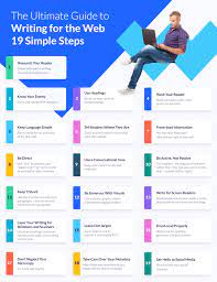
7 Essential Tips for Successful Website Creation
- Start with a plan – Before you even begin designing your website, it’s important to have a clear idea of what you want to achieve and the content that will be included. This will help inform your design decisions and ensure that all elements are cohesive.
- Keep it simple – You don’t need to overcomplicate things when creating a website; keep the design simple and easy to navigate for visitors.
- Choose the right platform – Depending on your goals, there are many different platforms available for building websites; choose one that is right for you and suits your needs.
- Make sure it’s responsive – It’s essential that your website is optimised for both desktop and mobile devices so visitors can access it from any device they have available.
- Use high-quality images – Images are an important part of any website, but make sure they’re of good quality and relevant to the content you’re displaying; low-quality images can be off-putting for visitors!
- Test before launch – Always test out the functionality of your website before launching it live; this will help prevent any problems from occurring after launch day!
- Monitor performance – Once launched, regularly monitor how well your website is performing in terms of traffic, conversions etc.; this data can then be used to improve future designs or campaigns if necessary
Start with a plan – Before you even begin designing your website, it’s important to have a clear idea of what you want to achieve and the content that will be included. This will help inform your design decisions and ensure that all elements are cohesive.
Start with a Plan: The Foundation of Successful Website Creation
When it comes to website creation, starting with a plan is an essential step that cannot be overlooked. Before diving into the exciting world of design and development, taking the time to create a solid plan sets the foundation for a successful and cohesive website.
Having a clear idea of what you want to achieve with your website is crucial. Begin by defining your goals and objectives. Are you looking to showcase your portfolio, sell products, provide information, or engage with your audience? Understanding your purpose will guide your design decisions and ensure that every element of your website serves a specific purpose.
Once you have established your goals, it’s time to consider the content that will be included on your website. Think about the information you want to convey and how it will be organized. This includes text, images, videos, and any other media you plan to incorporate. Having a clear understanding of your content will help determine the layout and structure of your website.
With goals and content in mind, you can now begin planning the overall design aesthetic. Consider factors such as color schemes, typography choices, and visual elements that align with your brand identity. It’s important to create a consistent visual experience throughout your website to establish brand recognition and enhance user engagement.
By starting with a plan, you ensure that all elements of your website work together harmoniously. It helps avoid haphazard design decisions or disjointed content placement that may confuse or frustrate visitors. A well-thought-out plan allows for efficient development as designers and developers have clear guidelines to follow.
Furthermore, having a plan in place saves time and effort in the long run. It minimizes the need for constant revisions or redesigns as you have already considered all aspects beforehand. This way, you can focus on refining details rather than making major changes.
Remember that creating a plan doesn’t mean everything is set in stone; it provides flexibility and a roadmap for your website creation journey. As you progress, you may discover new ideas or insights that can be incorporated into your plan. Embrace the iterative nature of website creation and be open to adjustments along the way.
In conclusion, starting with a plan is an essential tip for successful website creation. It ensures that your goals are clear, your content is organized, and your design choices are cohesive. So before you embark on the exciting journey of designing your website, take the time to create a solid plan – it will be the guiding light that leads you towards a remarkable online presence.
Keep it simple – You don’t need to overcomplicate things when creating a website; keep the design simple and easy to navigate for visitors.
Keep it Simple: The Power of Simplicity in Website Creation
When it comes to creating a website, simplicity is key. In a world filled with information overload and endless distractions, visitors appreciate a clean and straightforward design that allows them to navigate effortlessly. By keeping your website design simple and easy to navigate, you can enhance the user experience and make a lasting impression on your audience.
One of the biggest mistakes people make when designing a website is overcomplicating things. They mistakenly believe that adding flashy animations, complex layouts, and excessive features will impress visitors. However, the truth is that simplicity often trumps complexity.
A simple website design not only looks visually appealing but also ensures that visitors can find what they’re looking for quickly. By decluttering your layout and using clear navigation menus, you create an intuitive browsing experience that keeps users engaged.
Here are some reasons why keeping it simple in website creation is crucial:
- User-Friendly Experience: A simple design minimizes confusion and frustration for visitors. When elements are organized logically and presented in a clear manner, users can easily navigate through your website, find information effortlessly, and complete desired actions.
- Faster Loading Times: Complex designs with numerous elements tend to slow down loading times. This can lead to higher bounce rates as impatient visitors abandon slow-loading websites. By keeping your design simple, you reduce unnecessary code and optimize performance for a faster browsing experience.
- Mobile Responsiveness: With the increasing use of smartphones for web browsing, ensuring that your website is mobile-responsive is essential. Simple designs translate well across different screen sizes and devices, providing an optimal viewing experience for mobile users.
- Focus on Content: When your design is simple, the emphasis shifts towards your content – the heart of your website. Clear typography and ample white space allow your message to stand out without distractions, making it easier for visitors to absorb information.
- Brand Consistency: A simple design helps maintain brand consistency. By using a consistent color palette, typography, and visual elements throughout your website, you create a cohesive and memorable brand identity that resonates with your audience.
Remember, simplicity doesn’t mean sacrificing creativity or uniqueness. It’s about finding the perfect balance between aesthetics and functionality. By employing thoughtful design choices, such as using a clean layout, intuitive navigation menus, and concise content, you can create a visually appealing website that engages visitors and keeps them coming back for more.
So, when embarking on your website creation journey, remember the power of simplicity. Focus on providing an enjoyable user experience by keeping the design clean and easy to navigate. Your visitors will appreciate the simplicity and clarity of your website, ultimately leading to increased engagement and success in the digital realm.
Choose the right platform – Depending on your goals, there are many different platforms available for building websites; choose one that is right for you and suits your needs.
Choose the Right Platform: Building Your Website on Solid Ground
When it comes to website creation, one of the most crucial decisions you’ll make is choosing the right platform. With a plethora of options available, selecting a platform that aligns with your goals and suits your needs is paramount to the success of your online venture.
The first step in choosing a platform is understanding your objectives. Are you looking for a simple and user-friendly solution? Or do you require more advanced features and customization options? Consider factors such as budget, technical expertise, scalability, and future growth potential.
Content management systems (CMS) like WordPress, Wix, and Joomla are popular choices for beginners and experienced users alike. These platforms offer intuitive interfaces, extensive plugin libraries, and responsive templates that make website creation a breeze. They provide flexibility in design and functionality while catering to various industries and purposes.
For those seeking more control over their website’s design and functionality, custom-coded websites might be the way to go. This option allows for complete creative freedom but requires technical expertise or the assistance of professional developers.
E-commerce platforms such as Shopify or Magento are ideal for businesses looking to establish an online store. These platforms provide robust features like inventory management, payment gateways integration, and customer support tools tailored specifically for selling products or services online.
If you’re considering starting a blog or content-based website, platforms like Blogger or Medium offer simplicity and ease of use. These platforms focus on content creation rather than complex design elements.
It’s also important to consider scalability when choosing a platform. Will your chosen platform be able to accommodate future growth? Ensure that it offers room for expansion without compromising performance or requiring extensive redevelopment.
Moreover, take into account the level of support provided by the platform. Look for active communities, forums, documentation resources, and customer support channels that can assist you in troubleshooting issues or answering questions along the way.
Remember that each platform has its strengths and limitations, so it’s crucial to evaluate your specific requirements before making a decision. Research, compare features, and read user reviews to gain insights into the platform’s suitability for your needs.
Choosing the right platform sets a solid foundation for your website creation journey. It ensures that you have the necessary tools and features to bring your vision to life while providing a seamless user experience for your visitors.
So take your time, weigh your options, and select a platform that resonates with your goals. With the right choice, you’ll be well on your way to creating a website that not only meets but exceeds your expectations.
Make sure it’s responsive – It’s essential that your website is optimised for both desktop and mobile devices so visitors can access it from any device they have available.
Make Your Website Responsive: Reaching Every Device
In the digital era, where smartphones and tablets have become an integral part of our lives, it is crucial to ensure that your website is accessible and user-friendly across all devices. The key to achieving this lies in creating a responsive website design.
A responsive website design means that your site will automatically adjust its layout, content, and functionality to provide an optimal viewing experience on any screen size. Whether your visitors are browsing from a desktop computer, a laptop, a tablet, or a smartphone, they should be able to access and navigate your website seamlessly.
Why is responsiveness so important? Firstly, it enhances user experience. Visitors who land on your site using their mobile devices should not have to struggle with zooming in or scrolling horizontally to read content. A responsive design ensures that all elements are appropriately sized and positioned for easy readability and navigation on smaller screens.
Secondly, responsiveness plays a significant role in search engine optimization (SEO). Search engines like Google prioritize mobile-friendly websites in their rankings. Having a responsive design can improve your site’s visibility and increase organic traffic from mobile searches.
Moreover, making your website responsive demonstrates professionalism and adaptability. It shows that you value the user experience and are committed to providing the best possible service regardless of the device being used. This can help build trust with your audience and leave a positive impression of your brand.
To ensure that your website is truly responsive, consider the following tips:
- Use a mobile-first approach: Start designing with mobile devices in mind first, as they often have more limited screen space. Then progressively enhance the layout for larger screens.
- Optimize images: Compress images without sacrificing quality to minimize load times on mobile devices with slower internet connections.
- Simplify navigation: Create clear and concise menus that are easy to navigate with touch gestures on smaller screens.
- Test across devices: Regularly test your website on various devices and screen sizes to ensure a consistent experience for all users.
By making your website responsive, you are not only catering to the needs of your visitors but also future-proofing your online presence. With the increasing number of mobile users, having a responsive design is no longer an option; it’s a necessity.
So, whether your visitors are accessing your website from their desktops or on-the-go with their smartphones, make sure they can effortlessly engage with your content and enjoy a seamless browsing experience. Embrace responsiveness and empower your website to reach every device.
Use high-quality images – Images are an important part of any website, but make sure they’re of good quality and relevant to the content you’re displaying; low-quality images can be off-putting for visitors!
Use High-Quality Images: Enhancing Your Website’s Visual Appeal
When it comes to website creation, the saying “a picture is worth a thousand words” holds true. Images play a crucial role in capturing visitors’ attention and conveying your brand message effectively. However, it’s not just about including images; the quality and relevance of those images are equally important.
Low-quality images can be off-putting for visitors and can negatively impact their perception of your website and brand. Grainy, pixelated, or distorted images can give the impression of unprofessionalism and lack of attention to detail. On the other hand, high-quality images can elevate the visual appeal of your website and create a positive user experience.
So, why is using high-quality images so important? Here are a few reasons:
Visual Impact: High-quality images have a greater visual impact on visitors. They grab attention, evoke emotions, and leave a lasting impression. Whether you’re showcasing products, presenting portfolio samples, or sharing captivating visuals related to your content, using high-resolution images ensures that they look crisp and engaging.
Professionalism: Your website is often the first point of contact between your business and potential customers. By using high-quality images that are relevant to your content, you convey professionalism and attention to detail. This builds trust and credibility in the minds of your visitors.
User Engagement: Compelling visuals have the power to captivate users and keep them engaged on your website for longer periods. When users find visually appealing content that aligns with their interests or needs, they are more likely to explore further, read more about your offerings or share your content with others.
Brand Consistency: High-quality images contribute to maintaining brand consistency across different platforms. By using consistent visual elements throughout your website – such as color schemes, styles, and image quality – you reinforce brand recognition and help users associate those visuals with your business.
To ensure that the images on your website are of good quality and relevant to your content, consider the following tips:
Resolution: Use images with high resolution (typically 72-300 dpi) to ensure clarity and sharpness. Avoid stretching or compressing images beyond their original dimensions, as this can lead to distortion.
Relevance: Select images that directly relate to the content you’re displaying. Irrelevant or generic stock photos can appear disconnected and confuse visitors. Instead, opt for custom photography or carefully curated stock images that align with your brand identity.
Optimisation: Optimize image file sizes without compromising quality by using compression techniques or image editing software. This ensures faster loading times without sacrificing visual appeal.
Consistency: Maintain a consistent visual style throughout your website by using images that share similar aesthetics, such as color schemes, filters, or composition styles. This creates a cohesive and polished look.
Remember, high-quality images are not just about aesthetics; they contribute to the overall user experience on your website. By investing in visually appealing and relevant imagery, you can create a positive first impression, engage visitors, and build trust in your brand. So, choose wisely and let your visuals speak volumes about the quality of your website and business!
Test before launch – Always test out the functionality of your website before launching it live; this will help prevent any problems from occurring after launch day!
Test Before Launch: Ensuring a Smooth Website Launch
When it comes to website creation, one crucial tip that cannot be emphasized enough is the importance of testing before launching your website live. Testing the functionality of your website prior to its official launch can save you from potential problems and ensure a smooth user experience from day one.
Launching a website without proper testing can lead to various issues that may negatively impact your visitors’ experience and, ultimately, your brand’s reputation. Here are some reasons why testing is essential:
- Identify and Fix Bugs: Testing allows you to identify any bugs or technical glitches that may hinder the performance of your website. Broken links, missing images, or dysfunctional forms can frustrate users and deter them from engaging with your site. By thoroughly testing each page and feature, you can identify these issues early on and rectify them before they become bigger problems.
- Ensure Compatibility: With the multitude of devices, browsers, and operating systems available today, it’s crucial to ensure that your website functions properly across different platforms. Testing allows you to check for compatibility issues and make necessary adjustments to ensure a seamless experience for all users, regardless of their device or browser preference.
- Optimize Load Times: Slow-loading websites can drive visitors away and negatively impact search engine rankings. Testing helps you identify any elements or scripts that may be slowing down your site’s performance. By optimizing page load times through testing, you can provide a fast and efficient browsing experience for your users.
- User-Friendly Navigation: Testing allows you to evaluate the navigation structure of your website. Ensure that menus are intuitive, links are working correctly, and users can easily find the information they need. By conducting thorough tests on different devices and screen sizes, you can guarantee a user-friendly navigation experience across all platforms.
- Validate Forms and Functionality: If your website includes forms for contact inquiries or e-commerce transactions, it’s vital to test their functionality. Ensure that form submissions are being captured correctly, payment gateways are working seamlessly, and any automated emails or notifications are being sent out as intended. Testing these features will help prevent any potential issues that may arise during real-world usage.
In conclusion, testing before launching your website live is a critical step in the website creation process. It allows you to identify and fix bugs, ensure compatibility across devices and browsers, optimize load times, evaluate navigation structure, and validate forms and functionality. By investing time in thorough testing, you can launch your website with confidence, knowing that it will provide a seamless user experience from the very beginning.
So remember, always make testing an integral part of your website creation process. It’s a small step that can save you from significant headaches down the line and contribute to the long-term success of your online presence.
Monitor performance – Once launched, regularly monitor how well your website is performing in terms of traffic, conversions etc.; this data can then be used to improve future designs or campaigns if necessary
Monitoring Performance: The Key to Continuous Improvement in Website Creation
Creating a website is just the first step towards establishing your online presence. To ensure its success, it’s crucial to monitor its performance regularly. By keeping an eye on metrics such as traffic, conversions, and user behavior, you can gather valuable insights that will help you make informed decisions and improve future designs or campaigns.
Monitoring your website’s performance allows you to gauge its effectiveness in achieving your goals. Here are some key reasons why monitoring is essential:
- Tracking Traffic: Monitoring website traffic helps you understand how many visitors are coming to your site, where they are coming from, and which pages they are visiting the most. This data enables you to identify trends and patterns, allowing you to optimize your content and marketing strategies accordingly.
- Conversion Analysis: Tracking conversions is crucial for businesses looking to generate leads or drive sales through their website. By monitoring conversion rates, you can identify areas of improvement in your sales funnel or checkout process. This data can then be used to make necessary adjustments and enhance the user experience, ultimately increasing conversion rates.
- User Experience Insights: Monitoring user behavior on your website provides insights into how visitors interact with your content and navigate through different pages. Heatmaps, click-through rates, and bounce rates can reveal which sections of your site are engaging users the most and which areas need improvement. This information helps you make data-driven decisions when it comes to optimizing design elements and improving overall user experience.
- A/B Testing: Monitoring performance allows you to conduct A/B testing on various aspects of your website such as layouts, call-to-action buttons, or landing page designs. By comparing different versions of these elements and analyzing their performance metrics, you can determine which variations yield better results and implement those changes permanently.
- Feedback for Future Designs or Campaigns: The data collected from monitoring performance provides invaluable feedback for future iterations of your website or marketing campaigns. It helps you identify what worked well and what didn’t, enabling you to make data-backed decisions for future improvements.
To effectively monitor your website’s performance, consider using web analytics tools such as Google Analytics or other third-party platforms. These tools provide comprehensive data and reports that can be analyzed to gain actionable insights.
In conclusion, monitoring your website’s performance is an essential practice in website creation. By regularly reviewing metrics related to traffic, conversions, and user behavior, you can identify areas of improvement and make informed decisions to enhance future designs or campaigns. Remember, continuous monitoring allows for continuous improvement, ensuring that your website remains effective and aligned with your goals in the ever-evolving digital landscape.