
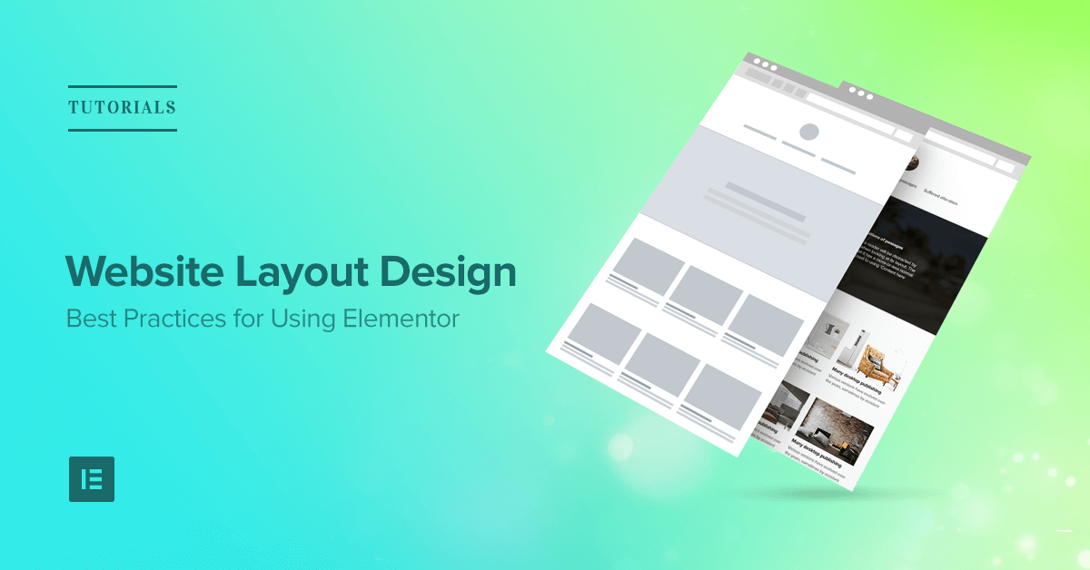
Web Layout Design: Creating Clear, Engaging Websites
Web layout design is the process of arranging text, images, navigation and other elements on a webpage. A well-planned layout helps visitors find what they need, understand a business or organisation, and take the next step with confidence. It also gives a website a consistent visual identity across different pages and devices.
Why web layout matters
Visitors often form an impression of a website within seconds. If a page feels cluttered, difficult to navigate or slow to understand, people may leave before exploring its content. A clear layout makes information easier to scan and helps guide visitors towards useful actions, such as reading an article, making an enquiry or buying a product.
Good layout design is not simply about making a website look attractive. It brings together appearance, accessibility and usability. Every element should have a purpose and support the visitor’s experience.
Start with the content and audience
Effective layouts begin with an understanding of the people who will use the website and the information they need. Before choosing colours or positioning images, consider the website’s purpose and identify its most important content.
For example, an online shop may need prominent product categories, clear product information and a straightforward checkout journey. A service-based business may prioritise its offering, customer testimonials and contact details. Organising content around visitors’ needs helps create pages that feel useful rather than confusing.
Create a clear visual hierarchy
Visual hierarchy shows visitors what to look at first, second and third. Designers establish it through size, position, colour, spacing and typography. A strong page might have a clear headline, a short introduction, a prominent image and a noticeable call to action.
Headings and subheadings also make content easier to scan. They break up long sections, signal what each part is about and help visitors find relevant details quickly. Using a consistent heading structure across the site makes the experience more predictable.
Make navigation simple
Navigation should help visitors understand where they are and how to reach other important sections. Keep menu labels short and familiar, and avoid including so many options that the menu becomes difficult to use.
It is also useful to provide clear links between related pages. A logical structure helps visitors move through the site without having to rely on the back button or search repeatedly.
Design for mobile as well as desktop
People use websites on a wide range of devices, from large desktop monitors to mobile phones. Responsive design allows a layout to adapt to different screen sizes. This may mean stacking columns, resizing images, adjusting text and making buttons easier to tap on smaller screens.
Designing for mobile involves more than shrinking a desktop page. Important content should remain easy to find, text should be comfortable to read, and interactive elements should work well with touch controls.
Use spacing, colour and typography with care
Whitespace—the empty space around content—gives a page room to breathe. It can separate sections, draw attention to important information and reduce visual clutter. A page does not need to fill every available area to feel complete.
Colour and typography should support both the brand and the content. A limited, consistent colour palette helps create a coherent look, while readable fonts make information easier to absorb. Strong contrast between text and its background is especially important for visitors with visual impairments.
Include accessibility from the beginning
Accessible layout design makes websites easier for more people to use. This includes people who navigate with a keyboard or screen reader, as well as those who have visual, motor or cognitive impairments.
Useful practices include providing clear headings, maintaining sufficient colour contrast, using descriptive link text and ensuring that interactive elements can be accessed without a mouse. Images that convey information should also have suitable alternative text.
Test and improve the layout
A layout may look effective in a design file but work differently in real use. Testing pages on various devices and browsers can reveal issues with spacing, readability or navigation. Feedback from users can show whether key information is easy to find and whether important tasks are straightforward to complete.
Web layout design is an ongoing process. As a website’s content, audience and goals change, its layout may need to change too. Reviewing performance and listening to visitor feedback can help keep the experience useful and up to date.
Conclusion
Thoughtful web layout design combines clear structure with an attractive, accessible presentation. By understanding the audience, prioritising important content, simplifying navigation and designing for different devices, organisations can create websites that are easier and more enjoyable to use. The strongest layouts do not distract from the message; they help visitors find it.
7 Key Benefits of Effective Web Layout Design
- Improves website navigation.
- Makes content easier to scan.
- Creates a strong first impression.
- Works across different screen sizes.
- Supports accessibility and usability.
- Highlights important information.
- Encourages visitors to take action.
Seven Common Pitfalls in Web Layout Design and Their Impact on User Experience
- Poor layouts can confuse visitors.
- Cluttered pages are hard to scan.
- Complex designs may load slowly.
- Inconsistent layouts weaken brand identity.
- Small text can reduce readability.
- Poor mobile layouts frustrate users.
- Inaccessible designs exclude visitors.
Improves website navigation.
A well-planned web layout improves website navigation by organising pages and information in a clear, logical way. Visitors can quickly see where to go next, find the content they need and move between sections without confusion. Clear menus, consistent page structures and noticeable links make the experience smoother, helping users stay engaged and complete tasks with confidence.
Makes content easier to scan.
A well-structured web layout makes content easier to scan by organising information into clear sections, using descriptive headings and leaving enough space between elements. Visitors can quickly spot the details they need without reading every word, making the page more straightforward to use. This is especially helpful for people browsing on mobile devices or looking for a specific answer.
Creates a strong first impression.
A well-designed web layout creates a strong first impression by making a website look professional, clear and welcoming from the moment it loads. Thoughtful use of spacing, colour, images and typography helps visitors understand the brand and find key information quickly. When a page feels polished and easy to use, it can build trust and encourage people to explore further.
Works across different screen sizes.
A well-designed web layout works across different screen sizes, from mobile phones and tablets to desktop monitors. Responsive layouts adjust content, images and navigation to suit each device, helping visitors read, browse and interact comfortably wherever they are. This creates a consistent experience without requiring users to zoom in, scroll awkwardly or struggle with controls.
Supports accessibility and usability.
A well-designed web layout supports both accessibility and usability by making content clear, consistent and easy to navigate. Logical headings, readable text, good colour contrast and clearly labelled links help visitors find information and understand how to use a site. When layouts also work with keyboards, screen readers and mobile devices, they provide a smoother experience for a wider range of people, including those with disabilities.
Highlights important information.
A well-planned web layout highlights the most important information, helping visitors quickly understand what a page offers and where to focus their attention. Clear headings, prominent placement, contrasting colours and well-spaced content can draw attention to key messages, services or calls to action. This makes the website easier to scan and helps visitors find what they need without unnecessary effort.
Encourages visitors to take action.
A well-designed web layout guides visitors towards the next step by making important actions easy to spot and understand. Clear calls to action, such as “Get in touch” or “Shop now”, work best when they are placed where visitors naturally expect them and stand out from surrounding content. By reducing distractions and making the journey straightforward, an effective layout can encourage people to enquire, sign up or make a purchase.
Poor layouts can confuse visitors.
Poor web layouts can leave visitors unsure where to look or what to do next. When navigation is unclear, information is poorly organised or important links and buttons are difficult to spot, people may struggle to find what they need. This can be frustrating, reduce confidence in the website and lead visitors to leave before completing an enquiry, purchase or other task.
Cluttered pages are hard to scan.
Cluttered web pages can be difficult to scan because too many competing elements—such as text, images, links and banners—make it harder for visitors to spot the information they need. This can leave people feeling overwhelmed, slow them down and increase the chance that they will miss important details or leave the site. A clearer layout, with well-organised content and enough space between sections, makes pages easier to understand and navigate.
Complex designs may load slowly.
Complex web layouts can take longer to load, particularly when they rely on large images, animations, videos or numerous interactive features. Slow-loading pages may frustrate visitors, increase the likelihood that they leave before the content appears, and make the website harder to use on mobile devices or slower internet connections. Keeping layouts focused, optimising images and limiting unnecessary effects can help improve loading speed without sacrificing the overall design.
Inconsistent layouts weaken brand identity.
Inconsistent layouts can weaken a brand’s identity by making a website feel disjointed and difficult to recognise. When pages use different fonts, colours, spacing or navigation styles without a clear reason, visitors may struggle to connect them with the same organisation. A consistent layout, on the other hand, creates a more cohesive experience, builds familiarity and helps reinforce the brand across every page.
Small text can reduce readability.
Small text can make a website difficult to read, particularly on mobile devices or for people with visual impairments. Visitors may need to zoom in or strain to follow the content, which can make browsing frustrating and cause them to leave. Using a clear, comfortably sized font, with suitable spacing and strong contrast, helps make text more accessible and enjoyable to read.
Poor mobile layouts frustrate users.
Poor mobile layouts can quickly frustrate users. Text that is too small, buttons that are difficult to tap and content that spills beyond the screen make a website harder to use on a phone. Visitors may struggle to find information or complete simple tasks, leading them to leave the site and look elsewhere. A responsive layout that adapts to smaller screens helps make browsing clearer and more comfortable.
Inaccessible designs exclude visitors.
Inaccessible web layouts can exclude visitors who use assistive technology or have visual, motor or cognitive impairments. Poor colour contrast, tiny text, unclear navigation and controls that cannot be used with a keyboard can make essential information difficult—or impossible—to access. Designing with accessibility in mind helps ensure that more people can use a website comfortably and independently.
