
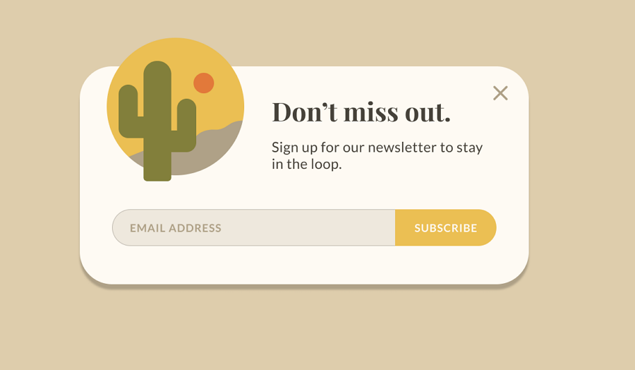
Modal Web Design: How to Use Pop-Ups Without Frustrating Visitors
Modal web design uses an overlay to bring a focused message or task to the foreground while the rest of a page is temporarily inactive. Common examples include sign-up forms, image galleries, confirmation messages and account login windows. Used thoughtfully, a modal can make an important action easier to complete. Used carelessly, it can interrupt visitors and make a website harder to use.
What is a modal?
A modal is a window that appears above the main page content. The page behind it is usually dimmed, signalling that attention should be directed to the window. In a true modal interaction, visitors must complete, dismiss or otherwise deal with the window before returning to the page.
Modals are different from non-blocking notifications, such as a small message that appears in a corner of the screen. They are also distinct from a new page, which changes the current location rather than placing a temporary layer over it.
When should a website use a modal?
A modal works best when a task is brief, relevant and closely connected to the visitor’s current activity. Suitable uses include:
- Confirming a consequential action, such as deleting an item
- Showing additional details without taking visitors away from the page
- Displaying an image or video in an enlarged view
- Collecting a small amount of information for a specific task
- Presenting a timely notice that visitors need to understand before continuing
Before adding one, consider whether the same information could be shown directly on the page. A modal should solve a clear design problem, not simply provide another place to display content.
Designing a modal that is easy to use
Keep the purpose clear
Give the modal a concise heading and explain why it has appeared. Visitors should be able to understand the message or task at a glance. If the window contains a form, label each field clearly and explain what happens when it is submitted.
Make dismissal straightforward
Provide a clearly visible close control and, where appropriate, a button to cancel. Many visitors expect the Escape key to close a modal, while clicking outside the window may also be an appropriate option. However, dismissal behaviour should be consistent and should not cause someone to lose work unexpectedly.
Keep the content focused
A modal has limited space, so avoid turning it into a miniature website. Remove unnecessary copy and actions. If a task requires several steps or extensive information, a dedicated page may offer a more comfortable experience.
Design for different screen sizes
On smaller screens, a modal must fit without hiding essential controls or forcing awkward scrolling. Consider using a full-screen presentation on mobile, and ensure that the close control remains visible. Test the design with long headings, error messages and larger text settings, not just the ideal example.
Accessibility matters
Modal accessibility is essential for visitors who use a keyboard or assistive technology. A well-built modal should:
- Move keyboard focus into the window when it opens
- Keep focus within the modal while it is active
- Return focus to the control that opened it when it closes
- Have a descriptive title that assistive technology can identify
- Offer a visible focus indicator and keyboard-accessible controls
- Prevent people from interacting with the background content while the modal is active
These behaviours should be tested with a keyboard and, where possible, screen-reading software. A modal that looks polished but traps users, hides its purpose or cannot be dismissed is not a successful design.
Timing and interruptions
Automatically opening a modal can disrupt visitors before they have had a chance to understand the page. Avoid showing one immediately on arrival unless there is a compelling reason. For promotional or subscription messages, consider whether visitors can first engage with the content, and make the offer easy to dismiss.
Repeated pop-ups can damage trust. Set sensible rules so that a dismissed message does not keep returning during the same visit, and avoid stacking several overlays on top of one another.
Performance and implementation
Modal behaviour should feel immediate and reliable. Keep animations subtle, avoid unnecessary scripts and make sure the window works even when content loads slowly. For web development teams, established dialog elements and accessible component libraries can help, but they still need to be configured and tested carefully.
Measure whether a modal is helping people complete the intended task. Useful indicators might include form completion, successful confirmations and how often visitors close the window without acting. Combine these figures with usability testing: a high click-through rate does not necessarily mean the experience is clear or welcome.
Conclusion
Modal web design is most effective when it gives visitors a focused way to complete a short, relevant task. Clear content, straightforward dismissal, responsive layouts and accessible keyboard behaviour all contribute to a better experience. Before introducing a modal, make sure it is genuinely more useful than presenting the same content directly on the page.
9 Benefits of Modal Web Design
- Focuses attention on important content.
- Keeps users on the current page.
- Supports quick, task-specific interactions.
- Works well for confirmations and alerts.
- Can display extra details on demand.
- Helps streamline short forms.
- Creates clear calls to action.
- Can adapt to different screen sizes.
- Reduces clutter in the main page layout.
Six Drawbacks of Modal Web Design
- Can interrupt visitors and disrupt their browsing.
- May frustrate users when difficult to dismiss.
- Can be challenging to use with keyboards or screen readers.
- Often feel cramped on smaller screens.
- Can slow pages if poorly implemented.
- May hide important content or reduce trust.
Focuses attention on important content.
One of the main advantages of modal web design is its ability to focus visitors’ attention on important content. By bringing a message, form or decision to the foreground and dimming the rest of the page, a modal helps people concentrate on the task at hand without distraction. Used at the right moment and kept clear and concise, it can make key information easier to notice and act on.
Keeps users on the current page.
One of the main advantages of modal web design is that it keeps users on the current page while giving them access to extra information or a quick task. Rather than sending visitors to a new page, a modal can display details, a form or a confirmation in a focused overlay, then let them return to where they left off. This can make journeys feel smoother and help users maintain their place and context—particularly when the modal is relevant, easy to close and does not interrupt them unnecessarily.
Supports quick, task-specific interactions.
Modal web design supports quick, task-specific interactions by bringing a focused action—such as confirming a choice, viewing an image or completing a short form—directly to the visitor. They can take care of the task without navigating away from the page, helping the experience feel quicker and more convenient.
Works well for confirmations and alerts.
Modals work well for confirmations and alerts because they bring important information to the user’s attention without taking them away from the page. They are useful for confirming consequential actions, such as deleting a file or submitting a form, and for displaying clear success or error messages. With concise wording and obvious choices, a modal helps visitors understand what has happened and decide what to do next.
Can display extra details on demand.
One of the key benefits of modal web design is the ability to display extra details only when visitors need them. By keeping the main page uncluttered and offering further information in a modal, you can help people stay focused while still giving them access to useful explanations, product specifications or supporting content on demand. This makes the experience easier to scan without hiding information from those who want to explore further.
Helps streamline short forms.
Modals can make short forms quicker and easier to complete by presenting only the essential fields in a focused window. Visitors can submit details, such as an email address or a brief enquiry, without leaving the page they are viewing. This keeps the process simple, reduces distractions and helps users complete the task with fewer steps.
Creates clear calls to action.
Modal web design can create clear calls to action by placing a focused message and a prominent button in front of visitors, making the next step easy to understand. By reducing distractions and keeping the action—such as signing up, booking a consultation or confirming a choice—at the centre of attention, a well-designed modal can encourage visitors to act. The message should remain relevant, concise and easy to dismiss so that it feels helpful rather than intrusive.
Can adapt to different screen sizes.
One of the advantages of modal web design is its flexibility across different screen sizes. A well-designed modal can adjust its width, height and layout to suit everything from a large desktop monitor to a mobile phone, keeping content readable and controls easy to use. On smaller screens, it can expand to fill most or all of the display, helping visitors complete a task without awkward scrolling or navigating away from the page.
Reduces clutter in the main page layout.
Modal web design helps reduce clutter by keeping secondary information, forms and actions out of the main page layout until they are needed. This allows the page to stay clean and focused, while visitors can still access extra details or complete a task in a separate window. Used thoughtfully, modals make important content available without overwhelming the primary experience.
Can interrupt visitors and disrupt their browsing.
One drawback of modal web design is that it can interrupt visitors and disrupt their browsing. A pop-up that appears unexpectedly—especially before someone has had time to explore the page—can break their concentration and make it harder to find the information they came for. If modals appear too often or are difficult to dismiss, visitors may become frustrated and leave the website altogether.
May frustrate users when difficult to dismiss.
A modal can quickly frustrate visitors if the close button is hard to find, too small to tap or does not work as expected. People may also struggle to dismiss it if the Escape key is ignored or clicking outside the window has no effect. When users feel trapped or are forced to complete an unwanted action, they may abandon the page altogether. Make the dismissal options clear, accessible and reliable so visitors remain in control.
Can be challenging to use with keyboards or screen readers.
One drawback of modal web design is that it can be difficult to use with a keyboard or screen reader if it is not built accessibly. Keyboard users may find themselves unable to reach the close button or move through the modal’s controls, while screen-reader users may not be told that a new window has appeared. Poorly managed focus can also leave people navigating content behind the modal. Clear labels, logical focus behaviour and reliable keyboard controls help make modals more accessible.
Often feel cramped on smaller screens.
Modals can feel cramped on smaller screens, where limited space makes it harder to display text, form fields and controls comfortably. Visitors may need to scroll within the window, while important buttons or the close control can be pushed out of view. Designing mobile-friendly modals with concise content, accessible controls and a layout that adapts to the screen can help, but for more complex tasks a dedicated page may provide a better experience.
Can slow pages if poorly implemented.
A poorly implemented modal can slow a page, particularly if it relies on heavy scripts, large images or third-party tools that load unnecessarily. Delays may make the website feel unresponsive and frustrate visitors, especially on mobile devices or slower connections. Keeping modal code lightweight, loading assets only when needed and testing performance across different devices can help avoid this problem.
May hide important content or reduce trust.
Modals can obscure important content and interrupt visitors before they have found the information they need. If they appear unexpectedly, are difficult to close or repeatedly promote an offer, they can feel intrusive and undermine trust in a website. Use modals only when they serve a clear purpose, make dismissal easy and avoid covering essential content.
