
Japanese Web Design: A Balance of Simplicity, Detail and Function
Japanese web design brings together a distinctive visual heritage and the practical demands of the modern internet. It can be calm and minimal, or colourful and richly layered. What often unites these different approaches is careful attention to detail, a strong sense of visual rhythm and a focus on helping people find what they need.
There is no single style that defines every Japanese website. Design choices vary by audience, industry and purpose. Looking at the ideas behind the approach, however, can offer useful inspiration for businesses and designers around the world.
Influences from Japanese visual culture
Traditional Japanese arts often make thoughtful use of space, texture, balance and contrast. These qualities can also be seen in digital design. A restrained colour palette, considered typography or an uncluttered layout can give content room to breathe, while small visual details add character and meaning.
One idea often associated with Japanese aesthetics is ma — the meaningful space between objects or moments. In web design, this can be reflected in spacing between sections, images and text. White space is not simply an empty area; it can guide attention, create a sense of calm and make a page easier to understand.
Other influences may include nature, seasonal change, craftsmanship and a respect for materials. These ideas can appear through subtle patterns, hand-drawn illustrations, textured backgrounds or imagery that feels closely connected to a place or story.
Minimalism and visual restraint
Some Japanese websites use a minimalist approach, with limited colours, clear grids and concise messaging. This can help a brand feel refined and make important information easier to notice. Minimalism works best when every element has a purpose: reducing clutter should not mean removing useful context or making navigation difficult.
Typography plays an important part in this balance. The choice of typeface, line length and spacing can influence how a page feels and how readily it can be read. Where a website includes both Japanese and English, the design must also account for differences in character shape, text length and line breaks.
When more is more
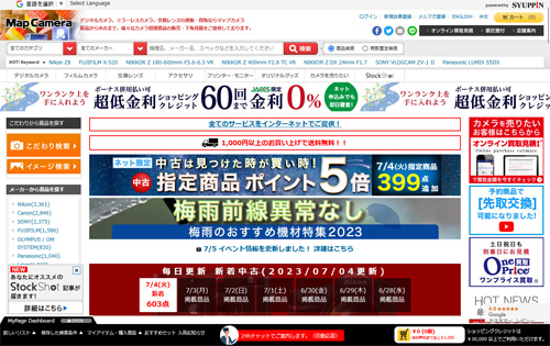
Not all Japanese web design is minimal. Some sites are energetic and information-rich, with vivid colours, prominent banners, multiple content panels and a busy visual rhythm. This approach can be effective when it reflects the expectations of the audience or the personality of the brand.
The key is organisation. A page can contain a great deal of information and still feel usable when it has a clear hierarchy, recognisable navigation and consistent visual cues. Designers need to decide what visitors should notice first, what they may want to explore next and how to prevent competing elements from becoming overwhelming.
Designing for language and culture
Japanese-language websites need to accommodate the way Japanese is written and read. Text may use a combination of kanji, hiragana and katakana, and the layout must remain legible across different screen sizes. Designers should test real content rather than relying on placeholder text, as character density and line wrapping can affect the appearance of a page.
For websites aimed at international visitors, translation alone is rarely enough. Localisation may involve adapting imagery, date and address formats, navigation labels, payment information and the order in which content is presented. A design that works well in one market may need adjustments to feel natural and clear in another.
Mobile usability and accessibility
As with any contemporary website, Japanese web design should work well on mobile devices. Flexible layouts, readable text, touch-friendly controls and appropriately sized images help create a consistent experience across screens. Important information should not be hidden behind interactions that are difficult to discover or use.
Accessibility deserves equal attention. Strong colour contrast, clear focus states, descriptive links, useful alternative text and a logical heading structure can make a site easier to use for a wider range of people. Good accessibility also tends to support clearer, more dependable design overall.
What businesses can learn from Japanese web design
- Use space with intention: spacing can guide attention and improve readability.
- Make detail count: small choices in typography, imagery and interaction can strengthen a brand.
- Match the audience: a minimal or information-rich layout should suit the people using the site.
- Build a clear hierarchy: help visitors understand what matters and where to go next.
- Design for real content: test layouts with the actual languages and information the site will contain.
- Prioritise usability: visual character should support, rather than obscure, the purpose of the website.
A thoughtful approach to digital design
Japanese web design is best understood not as a fixed look, but as a varied set of approaches shaped by culture, technology and audience expectations. Its most useful lessons are broadly applicable: treat space as part of the composition, pay close attention to detail and make every design decision serve the visitor.
Whether a website is quiet and restrained or bold and densely layered, the strongest results come from combining a clear purpose with a distinctive visual identity and an experience that is easy to use.
Understanding Japanese Web Design: Key Features, Cultural Influences, and Application for UK Websites
- What is Japanese web design?
- What are the key characteristics of Japanese web design?
- Why do some Japanese websites look busy or information-dense?
- How does Japanese culture influence web design?
- What colours, fonts and layouts are commonly used in Japanese web design?
- How do you design a website for Japanese-speaking audiences?
- How can Japanese web design principles be used on a UK website?
What is Japanese web design?
Japanese web design is an approach to creating websites that reflects Japanese visual culture, communication styles and user expectations. It can range from calm, minimalist layouts with generous space to colourful, information-rich pages. Rather than following one fixed style, it often pays close attention to detail, typography, balance and visual hierarchy, while adapting content and navigation for the needs of its audience.
What are the key characteristics of Japanese web design?
Japanese web design has no single defining style, but it often combines careful attention to detail with a strong sense of visual hierarchy. Some sites favour simplicity, generous spacing and restrained colours, while others use vibrant graphics and information-rich layouts. Common considerations include clear navigation, thoughtful typography, cultural context and layouts that work well with Japanese writing. The best designs balance visual character with accessibility and ease of use.
Why do some Japanese websites look busy or information-dense?
Some Japanese websites look busy or information-dense because they aim to present plenty of useful content, promotions and navigation options at a glance. This can reflect the needs and expectations of their audience, as well as the type of business or service the site offers. A page may include many visual elements, but a clear hierarchy, familiar navigation and consistent grouping can still make it easy to use. Japanese websites vary widely, so this is one design approach rather than a rule.
How does Japanese culture influence web design?
Japanese culture can influence web design through its attention to balance, detail and visual storytelling. Ideas such as ma—the purposeful use of space—may inspire calm, uncluttered layouts, while traditional patterns, seasonal imagery, nature and craftsmanship can add a distinctive visual character. Japanese-language sites also need to consider writing systems and reading conventions, which can shape typography and page structure. These influences are not a single fixed style: effective design adapts them to the audience and purpose of the website, while keeping navigation clear and content easy to use.
What colours, fonts and layouts are commonly used in Japanese web design?
Japanese web design has no single set of rules, but often combines colours, typography and layouts to suit the brand and audience. Palettes may draw on nature and traditional materials, using muted tones such as indigo, cream, charcoal and earthy shades, or brighter colours for a more energetic feel. Websites typically use clear, readable type, with Japanese and Latin fonts carefully paired when a site is bilingual. Layouts range from spacious, minimalist designs to denser pages with multiple content sections; in both cases, strong visual hierarchy and straightforward navigation help visitors find their way.
How do you design a website for Japanese-speaking audiences?
Designing a website for Japanese-speaking audiences involves more than translating its text. Use natural Japanese reviewed by a fluent speaker, and choose fonts and layouts that display Japanese characters clearly across desktop and mobile devices. Adapt navigation, imagery, date and address formats, and calls to action to suit the audience and context, while keeping the structure easy to follow. Test the finished site with Japanese-speaking users to check that the content feels natural, the design is culturally appropriate and key tasks are straightforward.
How can Japanese web design principles be used on a UK website?
Japanese web design principles can be adapted for a UK website without copying a particular visual style. Use spacing thoughtfully to create clarity, give content a clear hierarchy, and pay close attention to typography, colour and small details. You might also draw on ideas such as balance, simplicity and seasonal imagery, while keeping your brand and audience in mind. Most importantly, make sure the site remains easy to navigate, accessible and responsive, and test it with UK visitors to ensure the design feels natural and useful.
