
The Nostalgia of 90s Website Design
Remember the days of dial-up internet, Geocities, and animated GIFs? Ah, the nostalgia of 90s website design! The World Wide Web was a different place back then – a virtual playground where creativity ran wild and design rules were meant to be broken.
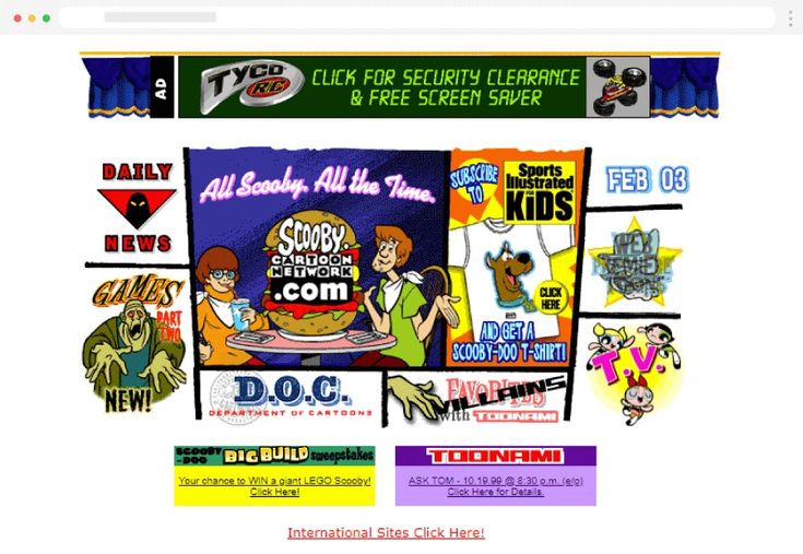
One look at a website from the 90s and you’re instantly transported back in time. Bright, clashing colours, pixelated images, and text-heavy pages were the norm. Websites were often crowded with animated backgrounds, flashing banners, and under construction signs – a chaotic yet charming aesthetic that defined the era.
Who could forget the infamous “Under Construction” GIF featuring a construction worker digging with a shovel? It was a common sight on websites as developers worked on updating content or building new sections. The concept of continuous updates and evolution was embraced even back then.
Fonts were another highlight of 90s web design. Comic Sans and Papyrus reigned supreme, adding a playful touch to websites. Text was often displayed in bright colours or outlined for emphasis, making it stand out against busy backgrounds.
Let’s not overlook the ubiquitous animated GIFs that graced every corner of 90s websites. From dancing babies to spinning logos, these looping animations added movement and personality to static pages. They may have been bandwidth-hungry, but they brought life to the digital world.
Despite its quirks and limitations, 90s website design captured an era of experimentation and innovation. It was a time when designers pushed boundaries, embraced new technologies, and crafted digital experiences that left an indelible mark on internet history.
As we look back on 90s website design with fondness and nostalgia, let’s appreciate the creativity and boldness that defined an era where anything seemed possible in the digital realm.
Celebrating the Charm of 90s Web Design: Five Reasons to Appreciate Its Bold Aesthetic
- 1. Bold and vibrant colour schemes added a playful and eye-catching aesthetic to websites.
- 2. Animated GIFs brought movement and interactivity to otherwise static web pages.
- 3. Quirky fonts like Comic Sans and Papyrus added personality and charm to text elements.
- 4. Creative use of backgrounds, patterns, and textures made websites visually engaging.
- 5. Embracing experimentation led to innovative design solutions that paved the way for future web development.
Challenges of 90s Website Design: Cluttered Layouts, Slow Loading, and Poor User Experience
1. Bold and vibrant colour schemes added a playful and eye-catching aesthetic to websites.
The bold and vibrant colour schemes of 90s website design added a playful and eye-catching aesthetic to websites, setting them apart from the more subdued designs of today. Bright hues like neon greens, electric blues, and fiery reds were commonly used to grab the attention of visitors and create a lively atmosphere. These striking colour choices not only made websites visually engaging but also reflected the exuberance and creativity of the era, leaving a lasting impression on users as they navigated through the digital landscape of the 90s.
2. Animated GIFs brought movement and interactivity to otherwise static web pages.
Animated GIFs were a standout pro of 90s website design as they injected a sense of movement and interactivity into what would otherwise be static web pages. These looping animations added a dynamic element to the user experience, captivating visitors and making the browsing journey more engaging. Whether it was a dancing baby, a spinning logo, or a flashing banner, animated GIFs brought life to the digital landscape of the 90s, showcasing the creative possibilities of incorporating motion graphics into web design.
3. Quirky fonts like Comic Sans and Papyrus added personality and charm to text elements.
One of the charming aspects of 90s website design was the use of quirky fonts such as Comic Sans and Papyrus. These unconventional typefaces injected personality and character into text elements, setting websites apart with a playful and informal vibe. Whether used for headings, body text, or navigation menus, these distinctive fonts added a touch of whimsy to the overall design, contributing to the unique charm that defined 90s web aesthetics.
4. Creative use of backgrounds, patterns, and textures made websites visually engaging.
One notable pro of 90s website design was the creative use of backgrounds, patterns, and textures that made websites visually engaging. Designers in the 90s embraced bold and vibrant backgrounds, often incorporating eye-catching patterns and textures that added depth and character to web pages. From psychedelic swirls to futuristic grids, these elements not only enhanced the visual appeal of websites but also set them apart from the static and monotonous designs of the early internet era. The dynamic use of backgrounds, patterns, and textures in 90s website design played a key role in creating immersive online experiences that captivated visitors and showcased the boundless creativity of web designers during that time.
5. Embracing experimentation led to innovative design solutions that paved the way for future web development.
Embracing experimentation in 90s website design led to innovative solutions that revolutionised the digital landscape and laid the foundation for future web development. Designers pushed boundaries, tried new techniques, and explored creative possibilities that were previously uncharted. This fearless approach not only resulted in visually striking websites but also introduced novel design elements and functionalities that continue to influence modern web design practices. The spirit of innovation from the 90s has shaped the evolution of web development, inspiring designers to think outside the box and create engaging online experiences that captivate audiences today.
Cluttered Layouts
One notable con of 90s website design was the prevalence of cluttered layouts. Websites from that era were often overloaded with excessive text, images, and animations, creating a chaotic visual experience for users. Navigating through these cluttered websites became a challenge as finding relevant information amidst the sea of distractions proved to be quite cumbersome. The lack of whitespace and organisation in 90s website layouts hindered user experience and made it harder for visitors to engage with the content effectively.
Slow Loading Times
During the 90s, one significant downside of website design was the slow loading times experienced by users. With limited internet speeds and bandwidth constraints, navigating 90s websites often meant enduring frustratingly long loading times. Users had to exercise patience as they waited for pages to load fully, testing their tolerance for delays in an era where instant access was far from the norm. The struggle with slow loading times highlighted the technological limitations of the time and underscored the importance of efficiency in web design for a smoother user experience.
Poor User Experience
The chaotic design elements of 90s websites could lead to a poor user experience, causing confusion and detracting from the overall usability of the site. With cluttered layouts, overwhelming colours, and excessive animations, users often found it challenging to navigate through the content seamlessly. The lack of intuitive navigation tools and inconsistent design patterns hindered user engagement and made it difficult for visitors to find the information they were seeking. As a result, poor user experience was a significant con of 90s website design that highlighted the importance of prioritising usability and user-centric design principles in the digital landscape.