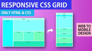
Tag: screen sizes
-
Mastering Responsive Web Design with CSS: Creating Seamless User Experiences
In today’s digital age, having a responsive website is essential for reaching and engaging with a diverse online audience. Responsive web design ensures that your website adapts seamlessly to different screen sizes and devices, providing users with an optimal viewing experience. One of the key components of responsive web design is CSS (Cascading Style Sheets),…
-
Crafting a Cutting-Edge Mobile Responsive Website for Your Business
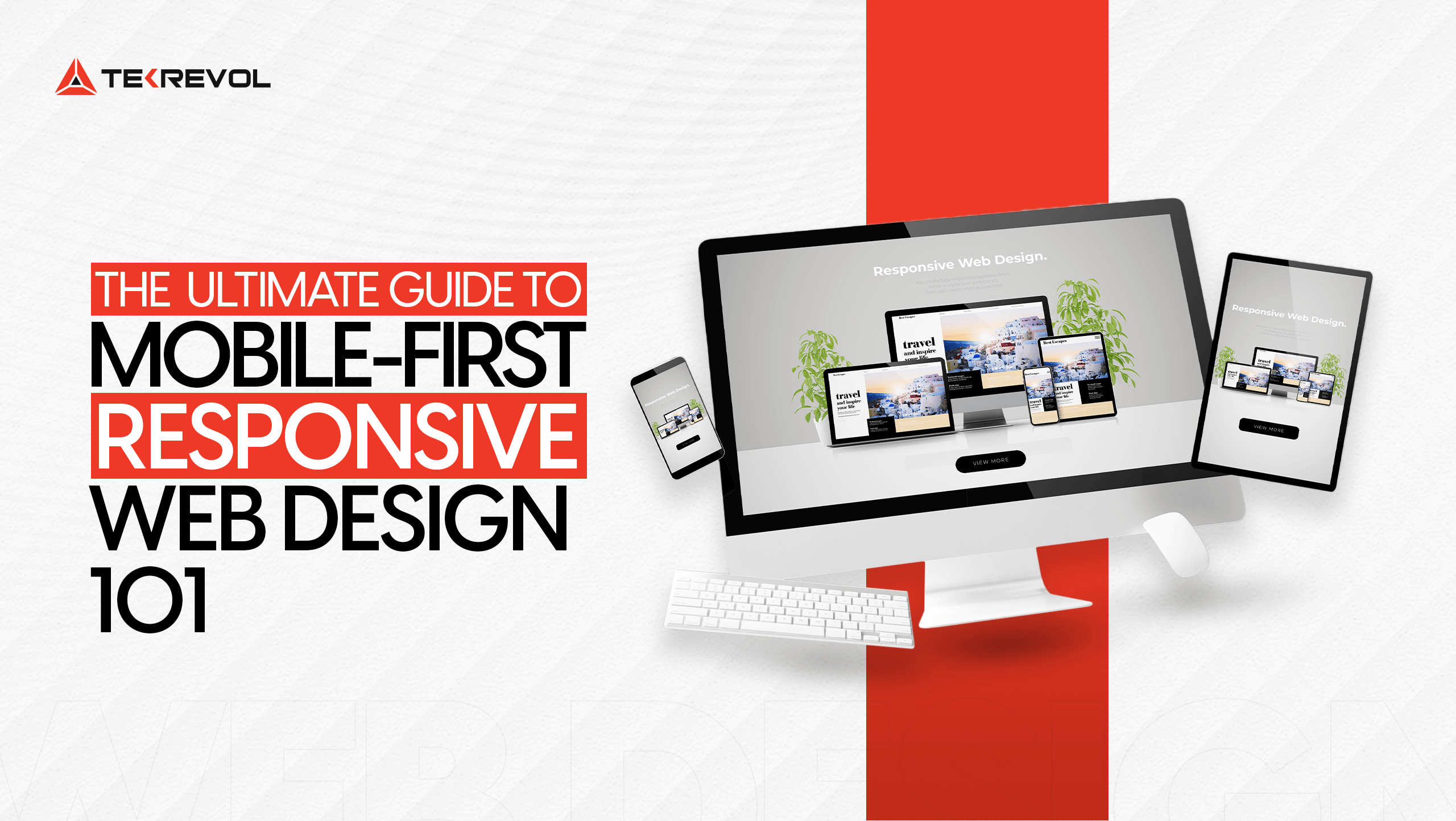
The Importance of Having a Mobile Responsive Website The Importance of Having a Mobile Responsive Website In today’s digital age, the use of mobile devices for browsing the internet has become increasingly prevalent. With more and more people accessing websites on their smartphones and tablets, it has become essential for businesses to have a mobile…
-
Mastering Mobile Responsive Design: Enhancing User Experience Across Devices

The Importance of Mobile Responsive Design The Importance of Mobile Responsive Design In today’s digital age, the use of mobile devices to access the internet has skyrocketed. With the increasing popularity of smartphones and tablets, it has become imperative for websites to be mobile responsive. Mobile responsive design is a design approach that ensures a…
-
Mastering the Art of Effective Web Layout Design
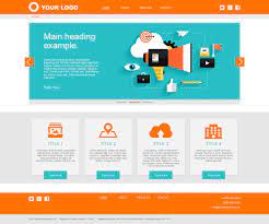
The layout of a website plays a crucial role in determining its overall look and feel. A well-designed web layout not only enhances the visual appeal of a site but also contributes to its usability and user experience. In the world of web design, the layout refers to how the various elements on a webpage…
-
Unveiling the Essence of Web Design: Understanding Its Meaning and Impact
Web design is the process of creating and designing websites that are visually appealing, user-friendly, and functional. It encompasses a variety of elements including layout, colour scheme, graphics, fonts, and content. The goal of web design is to create a website that not only looks great but also provides a seamless user experience. Good web…
-
Mastering the Art of Online Banner Design: Strategies for Success

The Art of Online Banner Design The Art of Online Banner Design Online banners are a crucial element of digital marketing campaigns. They are visual representations that aim to attract the attention of website visitors and drive them to take a specific action. Effective banner design can make a significant impact on the success of…
-
Crafting Exceptional User Experiences with Reactive Web Design
Understanding Reactive Web Design Reactive web design is a modern approach to creating websites that dynamically adjust and respond to the user’s behavior and environment. Unlike traditional static websites, reactive web design aims to provide a seamless and optimal user experience across various devices and screen sizes. One of the key principles of reactive web…