
Tag: flexbox
-
CSS Web Design: Creating Attractive, Responsive Websites

CSS Web Design: Creating Beautiful, Responsive Websites CSS is one of the essential building blocks of modern web design. Short for Cascading Style Sheets, CSS controls how a website looks and feels, from its colours and typography to its layout and behaviour on different screen sizes. Used alongside HTML, it helps turn a plain collection…
-
HTML Responsive Design: A Guide to Websites for Every Screen

HTML and Responsive Design: Creating Websites for Every Screen People browse the web on phones, tablets, laptops and large desktop screens. A website should be easy to use on all of them. Responsive design is the approach of building pages that adapt to different screen sizes and display conditions, rather than creating a separate website…
-
Creating a Responsive Website with CSS: Designing for Every Device
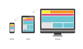
In today’s digital age, having a responsive website is crucial for businesses to reach their target audience effectively. A responsive website adapts seamlessly to different screen sizes and devices, providing users with an optimal viewing experience. One of the key components that make a website responsive is Cascading Style Sheets (CSS). CSS plays a vital…