
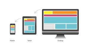
In today’s digital age, having a responsive website is crucial for businesses to reach their target audience effectively. A responsive website adapts seamlessly to different screen sizes and devices, providing users with an optimal viewing experience. One of the key components that make a website responsive is Cascading Style Sheets (CSS).
CSS plays a vital role in defining the layout, design, and overall look of a website. When it comes to creating a responsive website, CSS media queries are used to apply different styles based on the device’s screen size. By using media queries, web developers can set specific rules for how elements should be displayed on various devices, ensuring that the website looks great across desktops, laptops, tablets, and smartphones.
Another important aspect of responsive web design with CSS is fluid grids. Instead of fixed-width layouts, fluid grids use relative units like percentages to define the size of elements. This allows content to adapt and reflow based on the screen size, creating a more flexible and dynamic layout.
Furthermore, CSS flexbox and grid layout systems provide powerful tools for creating responsive designs. Flexbox allows developers to create complex layouts with ease by aligning and distributing space among items in a container. Grid layout enables designers to create multi-column layouts that adjust based on the available space.
In addition to layout techniques, CSS also offers features like viewport units and flexible images that help enhance responsiveness. Viewport units allow developers to specify dimensions relative to the viewport size, ensuring consistent sizing across devices. Flexible images can be styled using CSS properties like max-width: 100% to prevent them from overflowing their containers on smaller screens.
Overall, CSS plays a critical role in making websites responsive by enabling developers to create adaptive designs that deliver an optimal user experience across all devices. By leveraging CSS media queries, fluid grids, flexbox, grid layout systems, viewport units, and flexible images, web designers can build websites that are visually appealing and functional on any device. Embracing responsive website design with CSS is essential for staying competitive in today’s mobile-centric digital landscape.
Understanding Responsive Website Design: 7 Key Questions Answered
- What is a responsive website?
- What is the best CSS framework for responsive design?
- How to build a responsive website?
- How to create a responsive website using CSS grid?
- Is responsive design UX or UI?
- Can I make a responsive website using CSS?
- What is the difference between CSS and responsive CSS?
What is a responsive website?
A responsive website is a website that is designed and developed to adapt and adjust its layout, content, and design elements based on the screen size and device being used to view it. In essence, a responsive website ensures that users have a consistent and optimal viewing experience across various devices, such as desktop computers, laptops, tablets, and smartphones. This adaptability is achieved through the use of responsive design techniques like CSS media queries, fluid grids, flexible images, and layout systems like flexbox and grid. By implementing responsive web design principles, websites can effectively cater to the diverse browsing habits of users in today’s mobile-driven world, providing a seamless user experience regardless of the device they are using.
What is the best CSS framework for responsive design?
One frequently asked question in the realm of responsive website design is, “What is the best CSS framework for responsive design?” When it comes to choosing a CSS framework for responsive design, there are several popular options available, each with its own set of features and benefits. Some of the top CSS frameworks known for their responsiveness include Bootstrap, Foundation, and Bulma. Bootstrap, for instance, is widely used for its extensive library of pre-built components and grid system that simplifies the process of creating responsive layouts. Foundation offers a flexible grid system and a variety of customizable components suitable for building responsive websites. Bulma stands out for its lightweight nature and modern approach to styling elements responsively. Ultimately, the best CSS framework for responsive design depends on factors such as project requirements, familiarity with the framework, and personal preferences in terms of features and ease of use.
How to build a responsive website?
Building a responsive website involves implementing a combination of design principles and coding techniques, with CSS playing a crucial role in achieving responsiveness. To build a responsive website, web developers typically start by creating a flexible layout using CSS media queries to adjust styles based on different screen sizes. This includes setting breakpoints to define where the layout should change to accommodate various devices. Utilising fluid grids, CSS flexbox, and grid layout systems allows for dynamic and adaptable designs that respond effectively to different screen dimensions. Additionally, incorporating viewport units and flexible images ensures that content scales appropriately across devices. By following these best practices and leveraging CSS effectively, developers can create a responsive website that delivers an optimal user experience on desktops, laptops, tablets, and smartphones.
How to create a responsive website using CSS grid?
Creating a responsive website using CSS grid involves utilising the powerful layout system provided by CSS to design flexible and adaptive web layouts. CSS grid allows web developers to define complex multi-column structures with ease, making it ideal for building responsive designs. By setting up grid containers and defining rows and columns, designers can create layouts that automatically adjust based on the available screen space. Using CSS grid’s properties like grid-template-columns and grid-template-rows, developers can establish the desired structure of their website layout, ensuring that content flows smoothly and responsively across different screen sizes. With CSS grid, designers have the flexibility to create visually appealing and functional websites that provide an optimal viewing experience on various devices.
Is responsive design UX or UI?
The question of whether responsive design falls under user experience (UX) or user interface (UI) is a common one in the web design industry. Responsive design primarily focuses on the technical aspects of a website, such as layout, structure, and functionality to ensure optimal viewing across different devices. While UI design deals with the visual elements like colours, typography, and interactive elements that enhance the user interface. However, responsive design can impact both UX and UI aspects of a website. From a UX perspective, responsive design plays a crucial role in providing a seamless and intuitive user experience by ensuring easy navigation and accessibility on various devices. On the other hand, from a UI standpoint, responsive design influences how the interface elements adapt to different screen sizes to maintain consistency and aesthetic appeal. In essence, responsive design is an integral part of both UX and UI disciplines, working together to create a cohesive and user-friendly web experience.
Can I make a responsive website using CSS?
One of the most frequently asked questions in web design is, “Can I make a responsive website using CSS?” The answer is a resounding yes. CSS (Cascading Style Sheets) plays a fundamental role in creating responsive websites by allowing developers to apply styling rules that adapt to different screen sizes and devices. With the use of CSS media queries, fluid grids, flexbox, grid layout systems, viewport units, and other responsive design techniques, web designers can craft websites that automatically adjust their layout and appearance to provide an optimal viewing experience on desktops, laptops, tablets, and smartphones. By harnessing the power of CSS, it is indeed possible to create visually appealing and functional responsive websites that cater to a diverse range of users across various devices.
What is the difference between CSS and responsive CSS?
One frequently asked question in web design is about the difference between CSS and responsive CSS. CSS, or Cascading Style Sheets, is a fundamental technology used to style and format the layout of a website. It controls the visual presentation of elements on a webpage, such as fonts, colours, spacing, and positioning. On the other hand, responsive CSS refers to the use of CSS techniques specifically aimed at creating websites that adapt and respond to different screen sizes and devices. Responsive CSS utilises media queries, fluid grids, flexible images, and other techniques to ensure that a website’s layout adjusts dynamically based on the user’s device, providing an optimal viewing experience across desktops, laptops, tablets, and smartphones. In essence, while CSS focuses on styling elements on a webpage, responsive CSS is geared towards designing websites that are mobile-friendly and adaptable to various screen sizes for enhanced user experience.