
Responsive Design: Enhancing the User Experience Across Devices
In today’s digital age, where smartphones, tablets, and various other devices have become an integral part of our lives, it is crucial for businesses to adapt their online presence to cater to users across different platforms. This is where responsive design comes into play.
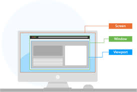
Responsive design is a web development approach that aims to create websites that automatically adjust and adapt to the user’s device, regardless of its screen size or orientation. In simpler terms, it ensures that your website looks and functions optimally on any device, providing a seamless user experience.
Gone are the days when people solely relied on desktop computers to access the internet. With the rise of mobile devices, users now expect websites to be accessible and easy to navigate on their smartphones or tablets. A responsive website eliminates the need for separate mobile versions or multiple URLs, streamlining the user experience and making it consistent across all devices.
One of the key benefits of responsive design is improved usability. By optimizing your website for different screen sizes, you ensure that users can easily interact with your content without having to zoom in or scroll excessively. This not only enhances user satisfaction but also reduces bounce rates and increases engagement.
Moreover, responsive design plays a significant role in search engine optimization (SEO). Major search engines like Google prioritize mobile-friendly websites in their rankings. By implementing responsive design principles, you improve your chances of appearing higher in search results and driving more organic traffic to your site.
Another advantage of responsive design is its cost-effectiveness. Instead of developing separate websites for different devices, responsive design allows you to maintain a single website that adapts fluidly across all platforms. This eliminates the need for duplicating content or managing multiple sites separately, saving time and resources.
Furthermore, as technology continues to evolve rapidly, new devices with varying screen sizes will emerge. With a responsive website in place, you future-proof your online presence by ensuring that your website remains accessible and visually appealing on any device that comes along.
Implementing responsive design requires careful planning and execution. It involves considering factors such as flexible grids, fluid images, and media queries to create a responsive layout that adjusts seamlessly to different devices. Working with experienced web designers and developers who specialize in responsive design is crucial to ensure the best results.
In conclusion, responsive design is no longer just an option; it has become a necessity in today’s mobile-driven world. By embracing this approach, businesses can provide their users with an optimal browsing experience, improve their search engine rankings, save costs, and future-proof their online presence. So, if you haven’t already, it’s time to make your website responsive and unlock its full potential across all devices.
7 Essential Tips for Responsive Design: Ensuring Compatibility across Devices
- Make sure your design works on all devices – mobile phones, tablets and desktops.
- Use CSS media queries to adjust the layout of a page according to the size of the device’s screen.
- Keep your page load times as low as possible by using optimized images and minifying your code.
- Utilise a fluid grid system to ensure that elements are sized proportionally across different devices.
- Ensure that all content is accessible from any device, including touchscreens and keyboards for larger screens or voice commands for smaller screens
- Test your design on multiple browsers and platforms to make sure it looks consistent across all devices
- Be aware of user behaviour when designing for mobile – users expect quick loading pages with easy navigation options
Make sure your design works on all devices – mobile phones, tablets and desktops.
In the ever-evolving digital landscape, ensuring that your website design works seamlessly across all devices is essential. With the increasing use of mobile phones, tablets, and desktops to access the internet, it has become crucial for businesses to prioritize responsive design.
Responsive design refers to creating websites that automatically adapt and adjust to different screen sizes and orientations. It ensures that your website looks visually appealing and functions optimally on mobile phones, tablets, and desktop computers alike.
Why is this so important? Well, consider this: mobile devices account for a significant portion of internet traffic. If your website isn’t optimized for mobile viewing, you risk losing potential customers who visit your site on their smartphones or tablets. A non-responsive website may appear distorted or difficult to navigate on smaller screens, leading to a frustrating user experience.
By implementing responsive design principles, you can provide a consistent and user-friendly experience across all devices. This means that regardless of whether visitors access your site on their mobile phones during their daily commute or on their desktops at work, they will have a seamless browsing experience.
A responsive design also improves your search engine rankings. Search engines like Google prioritize mobile-friendly websites in their search results. So if your website is not optimized for mobile viewing, it may rank lower in search results compared to competitors who have embraced responsive design. By making sure your design works on all devices, you increase the visibility of your website and attract more organic traffic.
To ensure that your design works effectively across different devices, consider factors such as flexible layouts, scalable images, and intuitive navigation menus. Test your website thoroughly on various devices to identify any issues or inconsistencies and make necessary adjustments.
In conclusion, making sure that your website design works seamlessly on all devices is crucial in today’s digital landscape. By embracing responsive design principles, you can provide an optimal user experience across mobile phones, tablets, and desktops. This not only enhances customer satisfaction but also improves your search engine rankings and helps you stay ahead of the competition. So, invest in responsive design and unlock the full potential of your website across all devices.
Use CSS media queries to adjust the layout of a page according to the size of the device’s screen.
Responsive Design Tip: Harness the Power of CSS Media Queries for Seamless Adaptability
In the realm of responsive design, CSS media queries are an invaluable tool that allows web developers to create layouts that seamlessly adapt to different screen sizes. By utilizing media queries, you can ensure that your website looks and functions optimally on a variety of devices, providing an exceptional user experience.
So, what exactly are CSS media queries? In simple terms, they are a feature in Cascading Style Sheets (CSS) that enable you to apply different styles and layout adjustments based on the characteristics of the user’s device. With media queries, you can target specific screen sizes or device types and make precise modifications to your website’s design.
The beauty of using CSS media queries lies in their flexibility and versatility. They allow you to define breakpoints at which specific styles or layout changes should take effect. For example, you can set rules for screens smaller than 600 pixels wide to display a simplified navigation menu or adjust font sizes for better readability on mobile devices.
By leveraging media queries effectively, you can create a responsive layout that adapts fluidly across various devices. Whether it’s a desktop computer with a large monitor, a tablet held in portrait mode, or a smartphone with a narrow screen – your website will respond intelligently to provide an optimal viewing experience.
Implementing CSS media queries requires careful consideration of your target audience and their common device sizes. By analyzing data such as screen resolutions and usage patterns, you can determine the breakpoints at which your design should adapt. This ensures that users on different devices receive an optimized version of your website without compromising functionality or aesthetics.
When using media queries, it’s essential to keep in mind the importance of progressive enhancement. This means starting with a solid foundation for all devices and then adding enhancements selectively for larger screens or more capable browsers. This approach ensures that even users with older devices or limited browsing capabilities can still access your content effectively.
In conclusion, CSS media queries are a powerful tool for achieving responsive design. They enable you to tailor your website’s layout and styles to fit the unique characteristics of each user’s device. By utilizing media queries effectively, you can create a seamless user experience that adapts effortlessly across screens of all sizes. So, embrace the power of CSS media queries and unlock the full potential of your responsive design endeavors.
Keep your page load times as low as possible by using optimized images and minifying your code.
Optimized Images and Code Minification: Enhancing Responsive Design Performance
When it comes to responsive design, one of the key factors that can significantly impact user experience is page load times. In today’s fast-paced digital world, users expect websites to load quickly, regardless of the device they are using. To achieve this, two important practices come into play: optimizing images and minifying code.
Images play a crucial role in website design, as they enhance visual appeal and convey information effectively. However, large image file sizes can slow down page loading times, especially on mobile devices with limited bandwidth. By optimizing images, you can strike a balance between visual quality and file size, ensuring faster loading times without compromising on aesthetics.
There are several ways to optimize images for responsive design. Firstly, you can resize images to their display dimensions rather than relying on CSS or HTML to scale them down. This reduces file size and eliminates unnecessary data transfer. Additionally, compressing images using tools or plugins specifically designed for optimization can further reduce file sizes without significant loss of quality.
Another important aspect of responsive design performance is code minification. When developing a website, developers often use libraries, frameworks, or custom code that may contain unnecessary characters such as white spaces or comments. These extra characters add to the overall file size and increase load times.
Code minification involves removing these unnecessary characters from HTML, CSS, and JavaScript files while preserving their functionality. This process reduces file sizes significantly and improves loading speed. Minification tools are available online that automate this process and generate optimized versions of your code.
By combining optimized images with minified code, you can create a responsive website that loads quickly across all devices. Not only does this enhance user experience by reducing wait times but it also positively impacts search engine rankings.
Search engines like Google consider page load times as a ranking factor when determining search results. Websites that load faster tend to rank higher in search engine listings, leading to increased visibility and organic traffic. Therefore, optimizing images and minifying code not only benefits users but also boosts your website’s overall performance in search engine optimization (SEO).
In conclusion, when implementing responsive design, it is essential to keep your page load times as low as possible. Optimizing images by resizing and compressing them, along with minifying your code, can significantly improve loading speed and enhance user experience. By reducing load times, you create a seamless browsing experience for your users while also improving your website’s visibility in search engine rankings. So, take the time to optimize your images and minify your code – the payoff will be worth it!
Utilise a fluid grid system to ensure that elements are sized proportionally across different devices.
Utilising a Fluid Grid System: Achieving Proportional Elements in Responsive Design
In the world of responsive design, where websites need to adapt seamlessly to various screen sizes and devices, one crucial tip stands out: Utilise a fluid grid system. This approach ensures that elements on your website are sized proportionally across different devices, creating a harmonious and visually appealing user experience.
A fluid grid system is based on the concept of relative units rather than fixed pixels. Instead of setting specific pixel values for elements like columns, images, or text boxes, you define their widths and heights in percentages or em units. This allows them to adjust proportionally depending on the screen size of the device being used.
By implementing a fluid grid system, you ensure that your website’s layout remains flexible and adaptable. Whether it’s viewed on a large desktop monitor or a small smartphone screen, your website will automatically adjust its elements to fit the available space without compromising readability or usability.
One of the significant advantages of using a fluid grid system is that it eliminates the need for media queries for every possible device size. Media queries are CSS rules that apply specific styles based on screen dimensions. While they are still necessary for fine-tuning certain design aspects in responsive layouts, relying solely on media queries can become cumbersome and time-consuming.
With a fluid grid system in place, you establish a solid foundation for your responsive design. It allows you to create consistent spacing between elements and maintain visual harmony throughout your website. Whether it’s aligning columns side by side or resizing images while maintaining their aspect ratios, a fluid grid system ensures that everything falls into place naturally.
Moreover, by utilising relative units like percentages or ems instead of fixed pixels, you make your website more accessible to users with different zoom levels or font preferences. Elements will scale accordingly without breaking the layout or causing content overflow issues.
Implementing a fluid grid system requires careful planning and consideration during the initial design phase of your website. Working with experienced web designers who understand the principles of responsive design is essential to achieve the desired results.
In conclusion, utilising a fluid grid system is a fundamental tip in responsive design. By adopting this approach, you ensure that elements on your website are sized proportionally across different devices. This not only creates a visually appealing experience but also enhances usability and accessibility. So, if you’re looking to create a responsive website that adapts seamlessly to various screen sizes, consider implementing a fluid grid system and unlock the full potential of your design.
Ensure that all content is accessible from any device, including touchscreens and keyboards for larger screens or voice commands for smaller screens
Creating a Seamless User Experience: Accessibility in Responsive Design
In the ever-evolving world of technology, user experience plays a vital role in the success of any website. When it comes to responsive design, ensuring that all content is accessible from any device is paramount. This means taking into account not only different screen sizes but also varying input methods such as touchscreens, keyboards, and even voice commands.
With the increasing popularity of touch-enabled devices, it’s crucial to optimize your website for touch interactions. This involves designing elements that are easy to tap or swipe, with sufficient spacing between clickable items to prevent accidental taps. By considering touchscreens in your responsive design strategy, you create a seamless and intuitive browsing experience for users on smartphones and tablets.
On the other hand, larger screens often come with physical keyboards or mouse inputs. It’s important to ensure that your website remains fully functional and accessible on these devices as well. Designing with keyboards in mind means providing clear focus states for interactive elements so that users can navigate through your site using tab and arrow keys effortlessly. This ensures an inclusive experience for individuals who rely on assistive technologies or prefer keyboard navigation.
Additionally, as voice commands become more prevalent on smaller screens through virtual assistants like Siri or Google Assistant, it’s crucial to consider voice interactions in your responsive design approach. By making your content easily navigable through voice commands, you cater to users who may have limited mobility or prefer hands-free browsing experiences.
The key to achieving accessibility across all devices lies in thoughtful design considerations. Ensuring that interactive elements are large enough for touch inputs while maintaining proper spacing is essential. Providing alternative text descriptions for images allows screen readers to convey information effectively. Structuring content with semantic HTML tags aids assistive technologies in understanding and presenting information accurately.
By incorporating accessibility principles into responsive design practices, you not only provide equal access to all users but also enhance the overall user experience. Remember that accessibility benefits everyone, including those with disabilities, older adults, and users in various contexts.
In conclusion, when implementing responsive design, it’s crucial to go beyond adapting to different screen sizes. Ensuring that all content is accessible from any device, including touchscreens and keyboards for larger screens or voice commands for smaller screens, is vital. By considering these factors in your design process, you create a seamless user experience that caters to the diverse needs of your audience.
Test your design on multiple browsers and platforms to make sure it looks consistent across all devices
Ensuring Consistency: Testing Your Responsive Design Across Browsers and Platforms
Responsive design is a powerful tool that allows websites to adapt seamlessly to different devices, providing an optimal user experience. However, to truly achieve this, it is essential to test your design on multiple browsers and platforms. By doing so, you can ensure that your website looks consistent and functions flawlessly across all devices.
Browsers come in various versions and have their unique rendering engines, which can sometimes interpret code differently. Therefore, testing your responsive design on multiple browsers helps identify any inconsistencies or layout issues that may arise. It enables you to make necessary adjustments and ensure a consistent experience for all users, regardless of the browser they choose.
Similarly, testing your responsive design across different platforms is equally important. Mobile devices run on different operating systems such as iOS and Android, each with its own set of quirks and nuances. By testing on various platforms, you can identify any platform-specific issues and address them accordingly. This ensures that users accessing your website from different devices have a smooth and consistent experience.
When conducting cross-browser and cross-platform testing for responsive design, there are several key elements to consider. Pay attention to the layout, typography, images, navigation menus, forms, media elements (such as videos or audio), and interactive features. Test how these components respond and adapt to different screen sizes and resolutions.
There are numerous tools available that can assist in cross-browser testing. Browser emulators or virtual machines allow you to simulate how your website will appear on different browsers without the need for physical devices. Additionally, online services provide real-time previews of how your website looks across multiple devices simultaneously.
It’s also worth considering manual testing on actual devices whenever possible. This hands-on approach allows you to experience firsthand how users will interact with your website on specific devices. It provides valuable insights into usability issues or performance concerns that automated tools may not detect.
Regularly testing your responsive design on multiple browsers and platforms should be an integral part of your web development process. It helps you identify and address any inconsistencies or compatibility issues, ensuring that your website delivers a consistent and enjoyable experience to all users, regardless of their chosen device or browser.
In conclusion, testing your responsive design across multiple browsers and platforms is crucial for achieving consistency and providing an optimal user experience. By dedicating time to this important step, you can iron out any design discrepancies, enhance usability, and ensure that your website looks and functions flawlessly across all devices.
Be aware of user behaviour when designing for mobile – users expect quick loading pages with easy navigation options
When it comes to designing for mobile devices, understanding user behavior is key. In today’s fast-paced world, users have high expectations for their mobile browsing experience. They want quick-loading pages and easy navigation options at their fingertips.
One of the fundamental aspects of responsive design is optimizing your website for speed. Mobile users are often on the go and have limited time, so they expect websites to load quickly. Slow loading times can lead to frustration and abandonment, resulting in lost opportunities for engagement or conversions.
To ensure fast-loading pages, consider optimizing your website’s images and code. Compressing images without compromising quality can significantly reduce file sizes and improve loading times. Additionally, minifying CSS and JavaScript files helps streamline code and minimize unnecessary data transfer.
Another crucial aspect of mobile design is providing easy navigation options. Mobile screens are smaller than desktop screens, so it’s essential to simplify your website’s navigation menu. Consider using collapsible menus or hamburger icons to save space while still offering access to all important sections of your site.
Additionally, implementing a clear and visible search bar allows users to find specific information quickly. This can be especially helpful when dealing with content-heavy websites or e-commerce platforms.
Furthermore, consider the placement of important elements on your mobile site. Users should be able to access vital information or complete desired actions without excessive scrolling or tapping around the screen. Keep key buttons or calls-to-action within reach of the user’s thumb for effortless interaction.
By being aware of user behavior when designing for mobile devices, you can meet their expectations for quick-loading pages and easy navigation options. This will not only enhance the user experience but also increase engagement and potentially drive conversions.
Remember that testing your website on various mobile devices is crucial in ensuring a seamless experience across different screen sizes and resolutions. By putting yourself in the user’s shoes and considering their needs and preferences, you can create a responsive design that truly caters to their expectations on mobile.