
The Bold and Unapologetic World of Brutalist Web Design
When it comes to web design, there’s a movement that is turning heads and sparking debates – Brutalism. Originating from the architectural style of the mid-20th century, brutalist web design embraces raw, unrefined aesthetics that challenge traditional design principles.
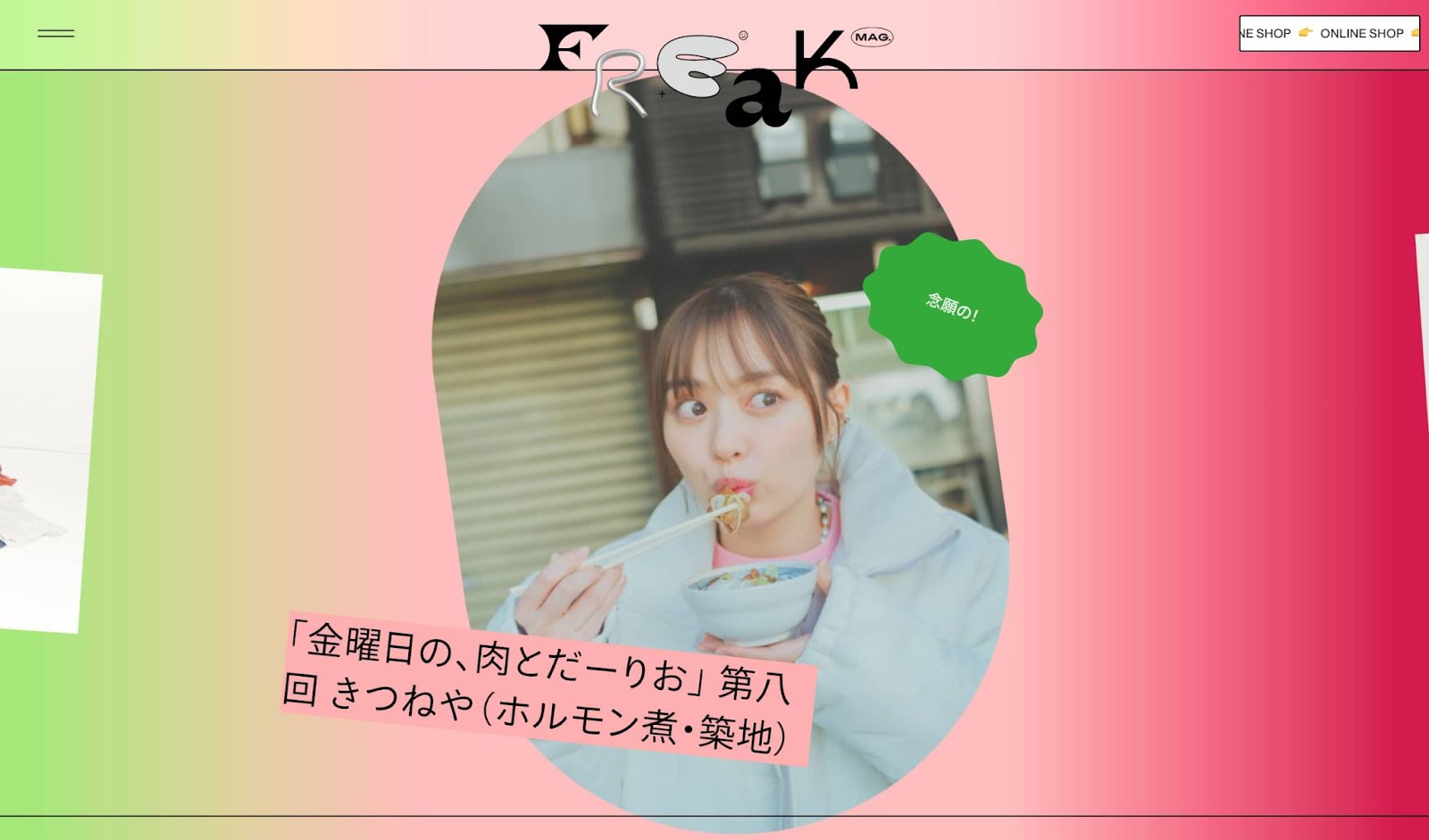
Characterised by its bold use of typography, stark colours, asymmetrical layouts, and lack of embellishments, brutalist websites make a statement by defying conventions and embracing a “less is more” approach. They often feature heavy text content, oversized elements, and a sense of rawness that can be polarising to viewers.
Proponents of brutalist web design argue that it offers a refreshing departure from the sleek and polished look of mainstream websites. By stripping away unnecessary elements and focusing on functionality over aesthetics, brutalist designs aim to deliver a no-nonsense user experience that prioritises content and usability.
However, critics argue that brutalist web design can be off-putting to users with its harsh visuals and unconventional layouts. The lack of visual hierarchy and minimalist approach may lead to confusion and frustration for some visitors who are accustomed to more traditional website designs.
Despite the polarising opinions, brutalist web design has gained traction among designers looking to push boundaries and experiment with new forms of expression. It challenges the status quo, encourages creativity, and sparks conversations about the role of aesthetics in digital experiences.
Whether you love it or hate it, there’s no denying that brutalist web design is making waves in the digital world. Its unapologetic approach forces us to question our preconceived notions of what a website should look like and opens up new possibilities for creative exploration in the ever-evolving landscape of web design.
8 Essential Tips for Mastering Brutalist Web Design
- 1. Use bold and stark typography for a strong visual impact.
- 2. Limit your colour palette to create a minimalist aesthetic.
- 3. Embrace asymmetry and irregular layouts for a unique look.
- 4. Focus on functionality over decorative elements.
- 5. Utilise high contrast colours to draw attention to key elements.
- 6. Experiment with large-scale photography or illustrations for dramatic effect.
- 7. Incorporate ample white space to enhance readability and focus.
- 8. Opt for simple, utilitarian navigation menus for ease of use.
1. Use bold and stark typography for a strong visual impact.
In brutalist web design, utilising bold and stark typography is key to creating a strong visual impact. By opting for oversized fonts, sharp contrasts, and minimalistic layouts, designers can capture the attention of visitors and convey a sense of rawness and authenticity. The use of striking typography not only adds character to the website but also reinforces the bold and unapologetic nature of brutalist design, making a statement that challenges traditional aesthetics.
2. Limit your colour palette to create a minimalist aesthetic.
Limiting your colour palette is a key tip in embracing the minimalist aesthetic of brutalist web design. By restricting the number of colours used on your website, you can achieve a clean and cohesive look that enhances the overall visual impact. Opting for a monochromatic scheme or selecting a few complementary colours can help create a sense of simplicity and elegance, while also drawing attention to important elements on the page. This deliberate choice in colour usage not only contributes to the overall aesthetic appeal but also reinforces the bold and unapologetic nature of brutalist design.
3. Embrace asymmetry and irregular layouts for a unique look.
To achieve a distinctive and unconventional aesthetic in brutalist web design, embracing asymmetry and irregular layouts is key. By breaking away from the constraints of traditional grid systems and opting for unbalanced compositions, designers can create a visually striking and memorable user experience. Embracing this sense of disorder adds an element of surprise and dynamism to the website, drawing users in with its unique look and challenging their expectations of structure and order.
4. Focus on functionality over decorative elements.
In brutalist web design, the emphasis is placed on functionality over decorative elements. By prioritising usability and practicality, brutalist websites strip away unnecessary embellishments to deliver a straightforward user experience. This approach ensures that the core content and features of the website take centre stage, allowing visitors to navigate easily and access information efficiently. In embracing simplicity and minimalism, brutalist design highlights the importance of functionality in creating a purposeful and effective digital platform.
5. Utilise high contrast colours to draw attention to key elements.
In the realm of brutalist web design, the strategic use of high-contrast colours serves as a powerful tool to highlight and draw attention to key elements on a webpage. By juxtaposing bold hues against each other, designers can create visual impact and guide users’ focus towards important content or calls to action. This deliberate choice in colour scheme not only adds a dynamic visual dimension to the design but also enhances the overall user experience by making essential information stand out prominently.
6. Experiment with large-scale photography or illustrations for dramatic effect.
In the realm of brutalist web design, one tip that can truly make a statement is to experiment with large-scale photography or illustrations for a dramatic effect. By incorporating oversized visuals, websites can captivate visitors and create a bold visual impact that demands attention. This approach not only adds a sense of grandeur and uniqueness to the design but also serves as a powerful storytelling tool, drawing users into the narrative of the website in an immersive and engaging way.
7. Incorporate ample white space to enhance readability and focus.
In the realm of brutalist web design, the tip to incorporate ample white space holds significant importance. By strategically utilising white space, designers can enhance readability and draw attention to key elements on the page. The generous use of empty spaces not only creates a sense of balance and sophistication but also allows content to breathe, making it easier for users to navigate and engage with the website. In a design style known for its boldness and minimalism, the judicious application of white space serves as a powerful tool to guide the user’s focus and elevate the overall user experience.
8. Opt for simple, utilitarian navigation menus for ease of use.
When implementing brutalist web design principles, it is essential to opt for simple, utilitarian navigation menus to enhance ease of use for visitors. By keeping navigation straightforward and functional, users can easily find their way around the website without distractions or unnecessary embellishments. This approach not only aligns with the raw and minimalist aesthetics of brutalist design but also prioritises user experience by focusing on practicality and efficiency in navigating the site.