
Apple Website Design: What Makes It So Effective?
Apple’s website is widely recognised for its clean appearance, striking product photography and straightforward navigation. Its design gives products room to take centre stage while helping visitors find information without unnecessary distractions. For businesses looking to improve their own websites, Apple offers useful lessons in clarity, consistency and thoughtful presentation.
A clear visual hierarchy
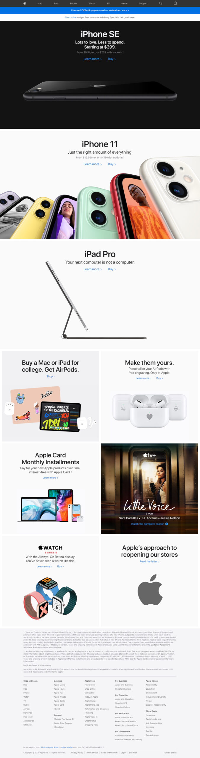
Effective website design guides visitors through a page in a natural order. Apple achieves this with strong headlines, carefully chosen supporting text and prominent imagery. Each section has a clear purpose, making it easier to scan the page and understand the main message.
This approach is useful for businesses of any size. A page should quickly answer three questions: what is being offered, why does it matter, and what should the visitor do next? Clear headings and concise copy can make those answers easier to find.
Product photography that does the talking
High-quality images are a defining feature of Apple’s website design. Products are shown in detail, often against simple backgrounds, so visitors can focus on their shape, finish and features. Images are used not just as decoration, but as an important part of the story.
For other brands, the lesson is to choose imagery that supports the content. Professional photographs, well-produced illustrations or carefully designed graphics can help explain a product and create a more polished impression. Images should also be optimised so they load quickly and display well on different screen sizes.
Minimal design with a purpose
Minimalism is not simply a matter of removing content. It means keeping what is useful and presenting it clearly. Apple’s pages typically use generous spacing, a restrained colour palette and a limited number of competing elements. This gives visitors room to concentrate on the information that matters.
Businesses can apply the same principle by removing unnecessary pop-ups, repetitive messages and decorative elements that do not support the page’s goal. A simpler layout can make important content more noticeable, provided it still answers visitors’ questions.
Consistent design across devices
A website needs to work well whether someone visits on a desktop computer, tablet or mobile phone. Apple’s responsive layouts adapt to different screen sizes, keeping content readable and key actions accessible. Navigation, images and page sections are arranged to suit the device rather than merely shrunk to fit.
Responsive design is essential for every modern website. Text should remain comfortable to read, buttons should be easy to tap, and pages should load efficiently on mobile connections. Testing on real devices can reveal problems that are easy to miss on a desktop screen.
Simple navigation and clear actions
Visitors should not have to work hard to find their way around. Well-organised navigation helps people move between products, services and support information with confidence. Clear calls to action, such as “Learn more” or “Buy”, also show visitors what they can do next.
Each page should have a primary purpose. Too many competing buttons can make the next step unclear, so calls to action should be relevant, easy to understand and placed where visitors are likely to need them.
Accessibility and usability
Good design should work for as many people as possible. Readable text, strong colour contrast, descriptive image text and keyboard-friendly navigation all contribute to a more accessible experience. These details benefit visitors with different needs and often make a website easier for everyone to use.
Take inspiration, not imitation
Apple’s website provides a strong example of how considered design can support a brand and its products. However, copying its appearance is unlikely to suit every organisation. A successful website should reflect its own audience, personality and objectives.
The most useful ideas to take away are simple: make the purpose of each page clear, use imagery thoughtfully, keep navigation intuitive and ensure the experience works across devices. When these principles are combined with original branding and useful content, they can help create a website that feels both distinctive and easy to use.
Apple is a trademark of Apple Inc. This article is for informational purposes and is not affiliated with or endorsed by Apple.
Apple Website Design FAQs: Style, HTML, Logo and Design Principles
- Is Apple website made with HTML?
- Why is Apple’s logo a bitten Apple?
- Why is the Apple website so good?
- How to design websites like Apple?
- What is Apple’s design style called?
- What is the Apple design style?
- How does Apple design their website?
Is Apple website made with HTML?
Yes, Apple’s website is built using HTML, the standard language used to structure web pages. It also relies on CSS for styling and JavaScript for interactive features, alongside other technologies and services. The exact tools can vary across different parts of the site, but HTML remains a fundamental part of how its content is presented in web browsers.
Why is Apple’s logo a bitten Apple?
The bite in Apple’s logo helps make the fruit instantly recognisable as an apple rather than a cherry or another small fruit, particularly when shown at a small size. Logo designer Rob Janoff has explained that the bite was added for scale and recognition; although it is often linked to the word “byte”, that connection was not the original reason for the design.
Why is the Apple website so good?
The Apple website is effective because it combines clean, consistent design with clear navigation and a strong focus on its products. High-quality imagery, concise copy and generous spacing make pages easy to scan, while responsive layouts help the experience work smoothly across devices. Clear calls to action guide visitors towards useful next steps without overwhelming them, creating a polished and intuitive experience.
How to design websites like Apple?
To design a website with the same polished feel as Apple’s, focus on clarity rather than copying its exact style. Use a clean layout, generous white space, strong typography and high-quality images that make your products or services the focus. Keep navigation simple, write concise, useful copy and give each page a clear purpose and call to action. Make sure the site is responsive, fast-loading and accessible, with readable text and easy-to-use controls across desktop and mobile. Most importantly, adapt these principles to your own brand and audience so the result feels distinctive as well as intuitive.
What is Apple’s design style called?
Apple’s design style is often described as minimalist, with an emphasis on simplicity, clean layouts, generous white space and clear typography. It also reflects the principles of Apple’s Human Interface Guidelines, which prioritise clarity, consistency and intuitive interaction. There isn’t one official name for the overall style, and its look has evolved over time, but “Apple-inspired minimalism” is a common way to describe it.
What is the Apple design style?
Apple’s design style is known for its simplicity, clean layouts and strong focus on usability. Its websites typically combine generous white space, clear typography, restrained colours and high-quality product imagery to keep attention on the content. Navigation is straightforward, while concise copy and prominent calls to action help visitors understand what to do next. The overall effect is polished and uncluttered, though the best approach for another business is to take inspiration from these principles while reflecting its own brand and audience.
How does Apple design their website?
Apple designs its website around clarity, visual impact and ease of use. It combines clean layouts, generous white space, concise copy and high-quality product imagery to help visitors focus on what matters. Consistent typography and navigation create a familiar experience, while responsive layouts adapt to different screen sizes. The result is a polished website that presents products clearly and makes it straightforward for visitors to find information and take the next step.
