
The Power of Dashboard Web Design
Dashboard web design has revolutionised the way we interact with data and information online. In today’s fast-paced digital world, having a well-designed dashboard can make all the difference in enhancing user experience and improving productivity.
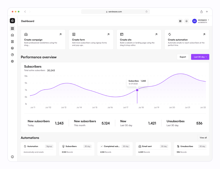
One of the key benefits of dashboard web design is its ability to present complex data in a visually appealing and easy-to-understand format. By using intuitive charts, graphs, and widgets, dashboards allow users to quickly grasp insights and make informed decisions based on real-time information.
Furthermore, dashboard web design enables users to customise their view according to their preferences and priorities. With interactive elements such as filters and drill-down options, users can delve deeper into the data and extract valuable insights with just a few clicks.
Another advantage of dashboard web design is its responsiveness across different devices. Whether accessed on a desktop computer, tablet, or smartphone, a well-designed dashboard adapts seamlessly to different screen sizes, ensuring a consistent user experience across all platforms.
Moreover, dashboard web design plays a crucial role in enhancing collaboration and communication within teams. By providing real-time updates and shared access to data, dashboards promote transparency and facilitate better decision-making processes among team members.
In conclusion, dashboard web design offers a powerful tool for presenting data effectively, improving user experience, and driving informed decision-making. As businesses continue to rely on data-driven insights for success, investing in a well-designed dashboard can be a game-changer in staying ahead of the competition.
Essential Tips for Designing an Effective and User-Friendly Dashboard
- Keep the design clean and uncluttered to improve readability
- Use consistent colour schemes and typography for a cohesive look
- Prioritise important information by placing it prominently on the dashboard
- Utilise white space effectively to avoid overwhelming the user with too much content
- Make sure the layout is responsive and works well on different screen sizes
- Include interactive elements like charts or graphs for data visualisation
- Regularly test and gather feedback to make improvements based on user experience
- Consider accessibility features such as text alternatives for images and keyboard navigation
Keep the design clean and uncluttered to improve readability
When it comes to dashboard web design, a crucial tip is to maintain a clean and uncluttered layout to enhance readability. By keeping the design simple and organised, users can easily navigate through the information presented on the dashboard without feeling overwhelmed. A clutter-free design not only improves the aesthetic appeal but also ensures that users can focus on the key data and insights, leading to a more effective and user-friendly dashboard experience.
Use consistent colour schemes and typography for a cohesive look
When designing a dashboard, it is essential to utilise consistent colour schemes and typography to achieve a cohesive and visually appealing look. By maintaining uniformity in colours and fonts throughout the dashboard, you create a sense of harmony and unity that enhances the overall user experience. Consistency in design elements not only improves aesthetics but also helps users navigate the dashboard more intuitively, leading to better comprehension and engagement with the data presented.
Prioritise important information by placing it prominently on the dashboard
In the realm of dashboard web design, a valuable tip to enhance user experience is to prioritise important information by placing it prominently on the dashboard. By strategically highlighting key data and insights in prominent areas, users can quickly access crucial information without having to navigate through cluttered interfaces. This approach not only improves usability but also ensures that users can make informed decisions efficiently, ultimately contributing to a more effective and user-friendly dashboard design.
Utilise white space effectively to avoid overwhelming the user with too much content
When designing a dashboard, it is essential to utilise white space effectively to prevent overwhelming the user with an excessive amount of content. White space, also known as negative space, plays a crucial role in enhancing readability and visual appeal. By strategically incorporating white space around elements such as charts, graphs, and data points, designers can create a sense of balance and clarity on the dashboard. This deliberate use of white space not only improves the overall aesthetics but also helps users focus on the most important information without feeling bombarded by cluttered visuals.
Make sure the layout is responsive and works well on different screen sizes
When designing a dashboard for optimal user experience, it is essential to ensure that the layout is responsive and functions seamlessly across various screen sizes. A responsive design adapts to different devices, such as desktops, tablets, and smartphones, providing users with a consistent and intuitive viewing experience. By prioritising responsiveness in dashboard web design, you can guarantee that users can access critical information efficiently regardless of the device they are using, promoting usability and accessibility across all platforms.
Include interactive elements like charts or graphs for data visualisation
In the realm of dashboard web design, incorporating interactive elements such as charts or graphs for data visualisation is a strategic tip that can elevate the user experience to new heights. By presenting complex data in a visually engaging format, these interactive elements not only enhance the aesthetic appeal of the dashboard but also enable users to explore and interpret data with ease. Through dynamic features like hover-over tooltips, clickable data points, and interactive filters, users can interact with the data in a meaningful way, gaining valuable insights and making informed decisions swiftly. This approach not only makes the dashboard more engaging but also empowers users to extract actionable information efficiently.
Regularly test and gather feedback to make improvements based on user experience
Regularly testing and gathering feedback on dashboard web design is essential for creating an optimal user experience. By actively seeking input from users and analysing their interactions with the dashboard, designers can identify pain points, usability issues, and areas for improvement. This iterative process allows for continuous refinement of the dashboard design based on real user feedback, ultimately leading to a more intuitive and user-friendly interface that meets the needs and expectations of its users.
Consider accessibility features such as text alternatives for images and keyboard navigation
When designing a dashboard for optimal user experience, it is essential to consider accessibility features such as providing text alternatives for images and enabling keyboard navigation. By incorporating text descriptions for images, users with visual impairments can still access and understand the content displayed on the dashboard. Additionally, implementing keyboard navigation ensures that individuals who rely on keyboard input for browsing can easily navigate through the dashboard without encountering usability barriers. Prioritising accessibility features not only enhances inclusivity but also demonstrates a commitment to creating a user-friendly and accessible dashboard design for all users.