
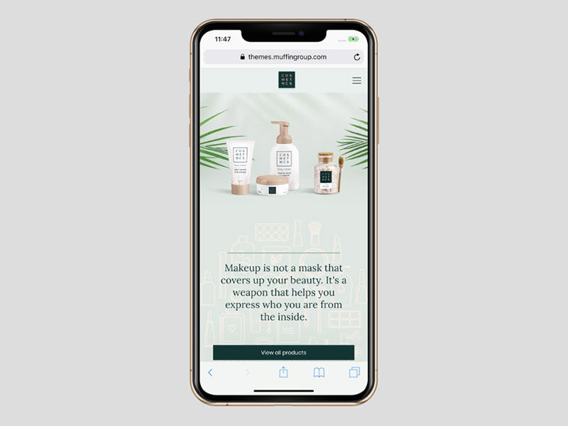
Mobile Site Design: Creating a Better Experience on Every Screen
More people browse the web on smartphones and tablets than ever before. A mobile-friendly website is no longer an optional extra: it is essential for helping visitors find information, complete tasks and connect with your business wherever they are.
Mobile site design is about more than shrinking a desktop website to fit a smaller screen. It means creating an experience that is easy to use, quick to load and thoughtfully arranged for touchscreens. When done well, it can make a website more welcoming for visitors and more effective for the organisation behind it.
What is mobile site design?
Mobile site design is the planning and development of websites for people using mobile devices. This includes considering screen size, touch controls, connection speeds and the different ways people use a phone compared with a desktop computer.
Many websites use responsive design, which allows the layout to adapt automatically to the visitor’s screen. Text, images, menus and other elements adjust to suit the available space, while the same website content remains accessible across devices.
Why mobile-friendly design matters
A website that works well on mobile makes it easier for visitors to take action. They might want to find opening hours, read an article, make an enquiry or buy a product. If buttons are difficult to tap or information is hard to read, they may leave before completing what they came to do.
Mobile usability can also affect how people perceive a business. A clear, reliable experience helps build confidence, while broken layouts and slow pages can make a company appear out of date. Search engines also consider mobile usability when assessing websites, so a well-designed mobile experience can support visibility in search results.
Key principles of effective mobile site design
Start with the visitor’s needs
Think about what people are most likely to need when they visit on a mobile device. Make important information easy to find and put common tasks within easy reach. A simple structure helps visitors move through the site without having to search through unnecessary content.
Make content easy to read
Use clear headings, concise paragraphs and readable text sizes. Leave enough space between lines and around links so that the page does not feel cramped. Avoid relying on visitors to zoom in or scroll sideways to read content.
Design for touch
Links, buttons and form controls should be large enough to tap comfortably, with enough space between them to prevent accidental selections. Use familiar labels and make it clear what will happen when someone taps a button.
Keep navigation simple
Navigation should help visitors understand where they are and how to reach other sections. A compact menu can work well on smaller screens, but it should be easy to find and operate. Keep the number of menu choices manageable and use descriptive wording.
Prioritise speed
Mobile visitors may be using a slower connection, so fast loading times matter. Large images, unnecessary scripts and complex page elements can make a site feel sluggish. Compress images, remove features that do not add value and test pages on different connections and devices.
Make forms straightforward
Long forms can be especially frustrating on a phone. Ask only for the information you need, use suitable input types and provide clear instructions. For example, a mobile number field should bring up a numeric keypad where possible. Error messages should explain how to fix a problem.
Responsive design and mobile-first design
Responsive design ensures that a website adapts to different screen sizes, from small phones to large desktop monitors. It is a practical way to provide a consistent experience across devices without creating a separate site for each screen type.
Mobile-first design takes a slightly different approach: the website is planned for smaller screens first, then expanded for larger ones. This encourages teams to focus on the most important content and functions before adding features that suit larger screens.
Both approaches can produce excellent results. The right choice depends on the website, its audience and the way visitors use it. In either case, testing on real devices is important, as layouts can behave differently across browsers and screen sizes.
Common mobile design mistakes to avoid
- Using text that is too small or tightly spaced.
- Placing buttons and links too close together.
- Hiding essential information behind difficult-to-use menus.
- Using large images that slow down page loading.
- Showing pop-ups that are hard to close on a small screen.
- Making visitors enter the same information more than once.
- Assuming that a site works well simply because it looks acceptable on one phone.
How to improve your mobile website
Begin by reviewing the website on a range of phones and tablets. Check that pages load quickly, text is comfortable to read and key tasks can be completed without unnecessary effort. Ask people who are unfamiliar with the site to try common tasks, such as finding a service or submitting an enquiry. Their feedback can reveal problems that may not be obvious to the people who built the website.
Website analytics can also show how mobile visitors behave. Look at which pages they visit, where they leave and whether they complete important actions. Use these insights to make gradual improvements, then test the results rather than relying on assumptions.
Designing for the way people browse today
Good mobile site design combines clear content, simple navigation, fast performance and accessible controls. It recognises that people may be browsing on the move, using one hand or working with limited time and connectivity.
By putting visitors first and testing the experience across devices, businesses can create websites that feel straightforward and dependable on every screen. A mobile-friendly website is not just a smaller version of a desktop site; it is an important part of delivering a better experience online.
Top 5 Tips for Effective Mobile Site Design
- Design for small screens first.
- Keep navigation simple and clear.
- Make buttons large enough to tap.
- Optimise images for fast loading.
- Use readable text with strong contrast.
Design for small screens first.
Designing for small screens first helps you focus on what visitors need most. Start with the essential content and features, then arrange them in a clear, simple layout that works well on a phone. This approach encourages readable text, easy-to-tap buttons and straightforward navigation, while making it easier to adapt the design for larger screens later.
Keep navigation simple and clear.
Keep your mobile navigation simple and clear so visitors can find what they need without unnecessary taps. Use familiar, descriptive labels, prioritise the most important pages and avoid overcrowding the menu with too many options. Make the menu easy to open and close, and ensure links are large enough to tap comfortably on a touchscreen.
Make buttons large enough to tap.
Make buttons large enough to tap comfortably on a touchscreen, with enough space around them to prevent accidental clicks. This is especially important for visitors using smaller screens or browsing with one hand. Clear, well-spaced buttons make it easier for people to navigate your site and complete actions such as making an enquiry or placing an order.
Optimise images for fast loading.
Optimise images to help your mobile site load quickly, especially for visitors using slower connections. Resize each image to suit the space it appears in, choose an efficient file format and compress it without noticeably reducing quality. You can also use responsive images so mobile devices download appropriately sized files, and lazy loading so images further down the page load only when needed. These small improvements can make pages feel faster and easier to use.
Use readable text with strong contrast.
Use text that is easy to read on a small screen, with a clear font, a comfortable size and enough space between lines. Strong contrast between the text and background—such as dark text on a light background—helps visitors read without straining, including people with visual impairments or those browsing in bright sunlight. Avoid pale text, busy backgrounds and tiny type, and check that your colour choices remain clear across different devices.
