
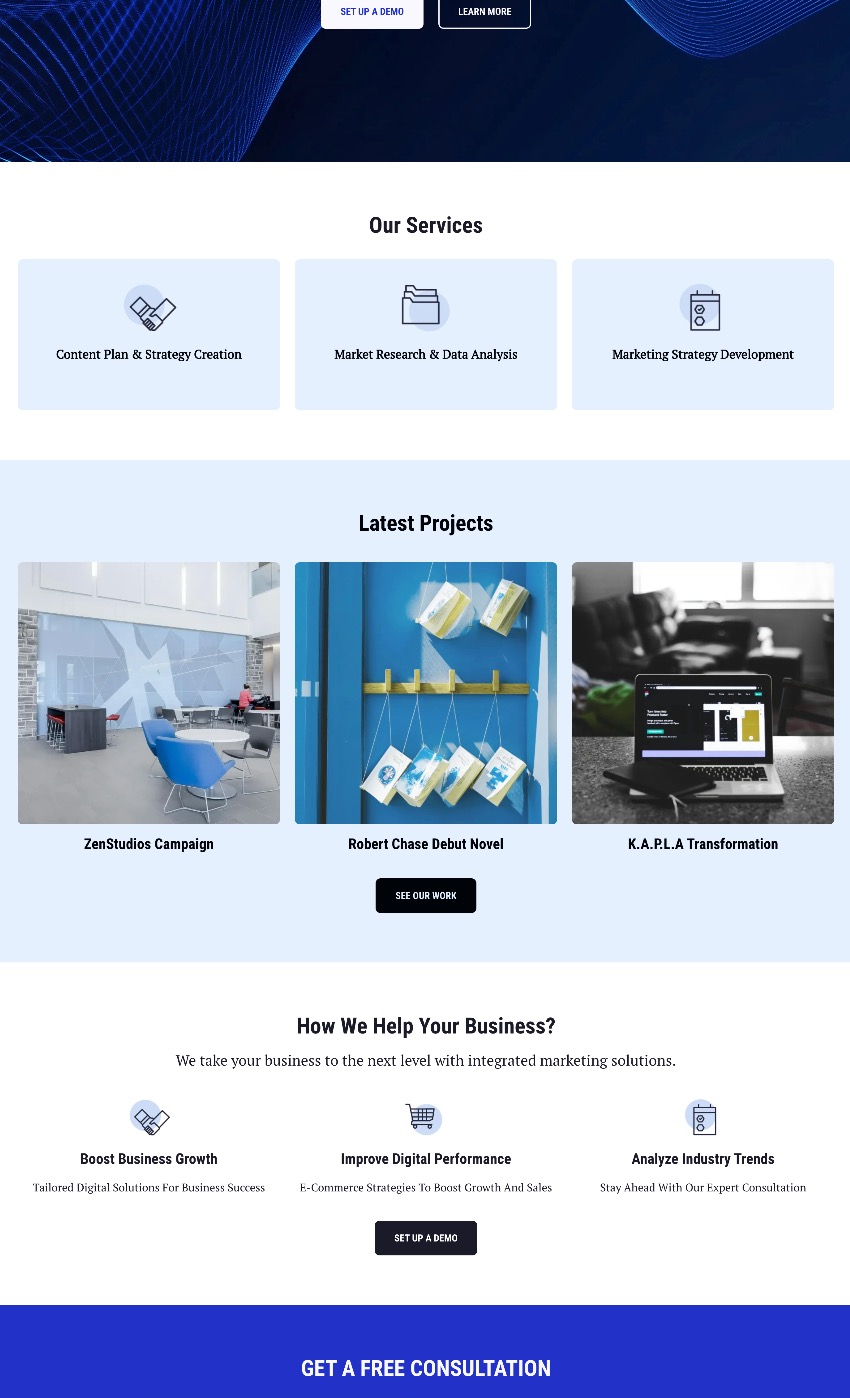
Latest Website Design Trends: What’s Shaping the Web
Website design continues to evolve as technology, user expectations and browsing habits change. The latest approaches go beyond visual appeal: they make websites easier to use, quicker to load and more relevant to the people visiting them. For businesses, the strongest designs balance fresh ideas with a clear purpose.
Design that puts people first
Simple navigation, readable content and clear calls to action remain essential. Current designs increasingly focus on helping visitors find what they need without unnecessary steps. Well-organised pages, concise menus and consistent layouts make a website easier to use on any device.
Accessibility is also becoming a more central part of the design process. Clear colour contrast, keyboard-friendly navigation, descriptive links and text alternatives for images help make websites usable by more people. These details can improve the experience for all visitors, not just those using assistive technology.
More expressive typography and layouts
Designers are using distinctive typography, confident headings and flexible layouts to give brands a recognisable online presence. Modular arrangements—sometimes called “bento” layouts—bring different types of content together in clearly defined sections. When used thoughtfully, they make complex information easier to scan.
Bold design works best when it supports the message. Strong colours, large type and unexpected layouts should guide attention rather than compete with the content.
Subtle motion and interaction
Small animations can make a website feel more responsive. A button changing state, an image appearing as a visitor scrolls or a menu opening smoothly can provide helpful feedback and make interactions more engaging.
However, motion should be used with care. Too many effects can slow a page, distract visitors or make the experience uncomfortable. Good design keeps animation purposeful and allows for reduced-motion preferences where possible.
Personalised experiences, handled responsibly
Data and artificial intelligence are creating new ways to tailor website content to different audiences. Personalised recommendations, helpful search features and conversational support can make it easier for visitors to find relevant information.
Personalisation should be transparent and respectful. Businesses need to consider privacy, explain how information is used and make sure automated features provide useful, accurate assistance.
Speed and performance as design priorities
A polished website is only effective if it loads reliably. Designers and developers are paying closer attention to image sizes, efficient code and the number of scripts running on a page. Fast-loading websites are more pleasant to use, particularly on mobile connections, and help visitors stay focused on what matters.
Performance is not just a technical issue. Choosing lighter page layouts and optimised media from the start can make a real difference to the finished design.
Mobile-first, rather than mobile as an afterthought
Many visitors browse on a phone, so modern websites are planned around smaller screens from the outset. This means considering touch-friendly controls, legible text, compact navigation and content that adapts naturally to different screen sizes.
A responsive design should feel considered on every device, not simply shrink the desktop version to fit a phone.
Sustainability and simpler websites
There is growing interest in websites that use fewer resources. Efficient code, optimised images and restrained use of video and animation can reduce data use while improving speed. A simpler site can also be easier to maintain and update.
What makes a website design successful?
Trends can offer inspiration, but they are not a substitute for understanding your audience. The most effective website design reflects the character of the business, supports its goals and makes it straightforward for visitors to take the next step.
Before adopting a new visual style or feature, consider whether it improves the experience. A clear, accessible and fast website will often serve a business better than a design that follows every trend. The best results come from combining contemporary ideas with a strong understanding of what users actually need.
8 Essential Tips for Modern Website Design
- Design for mobile first, then scale up.
- Use bold typography to create clear hierarchy.
- Choose accessible colours with strong contrast.
- Add subtle motion, not distracting animation.
- Keep navigation simple and predictable.
- Use generous whitespace to reduce clutter.
- Optimise images and scripts for fast loading.
- Make dark mode an option where it suits the site.
Design for mobile first, then scale up.
Designing for mobile first means starting with the needs of people using smaller screens, then adapting the experience for tablets and desktops. Prioritise the essential content, keep navigation simple, use readable text and make buttons comfortable to tap. Once the mobile layout works well, add space and features for larger screens without compromising speed or usability. This approach helps create a consistent, accessible website for visitors on any device.
Use bold typography to create clear hierarchy.
Use bold typography to create a clear visual hierarchy and help visitors understand your content at a glance. Strong, well-chosen headings draw attention to key messages, while differences in size and weight separate titles, subheadings and body text. Keep the style consistent and make sure text remains easy to read across screen sizes; bold type should guide the eye, not overwhelm the page.
Choose accessible colours with strong contrast.
Choose accessible colours with strong contrast to make your website easier for everyone to read and use. Ensure text stands out clearly against its background, and don’t rely on colour alone to communicate important information—use labels, icons or patterns as well. Checking your colour combinations with a contrast tool can help you create a more inclusive experience for visitors, including people with visual impairments.
Add subtle motion, not distracting animation.
Add subtle motion to make your website feel responsive and intuitive, rather than using animation simply for decoration. Small effects—such as a button changing colour when hovered over or content appearing gently as visitors scroll—can provide useful feedback and guide attention. Keep transitions quick and restrained, and ensure the site remains easy to use for people who prefer reduced motion. Done well, animation supports the experience without distracting from your message.
Keep navigation simple and predictable.
Keep website navigation simple and predictable so visitors can find what they need without having to think twice. Use familiar menu labels, organise pages into clear sections and place key links where people expect to find them. A consistent navigation experience across desktop and mobile helps users feel confident, reduces frustration and makes it easier for them to take the next step.
Use generous whitespace to reduce clutter.
Generous whitespace—the space around text, images and other elements—helps a website feel calm, clear and easy to navigate. Rather than filling every part of a page, give content room to breathe: use comfortable margins, clear spacing between sections and uncluttered layouts. This makes key information easier to scan and helps important buttons or messages stand out. Whitespace does not need to be white; it is simply the intentional space that gives a design balance and reduces visual clutter.
Optimise images and scripts for fast loading.
Optimising images and scripts is one of the simplest ways to make a modern website feel faster. Compress images and serve them in efficient formats, choosing dimensions that suit each screen rather than loading oversized files. Remove unnecessary scripts and defer non-essential ones so they do not delay important content. These improvements can reduce loading times, especially on mobile connections, and help visitors access the information they need without waiting.
Make dark mode an option where it suits the site.
Offer dark mode when it suits your website and audience, giving visitors the choice to switch to a darker colour scheme if they prefer. A well-designed dark mode can feel more comfortable in low-light settings and reduce glare, but it should preserve clear contrast, readable text and recognisable brand colours. Let visitors switch modes easily, and consider remembering their preference or following their device settings.
