
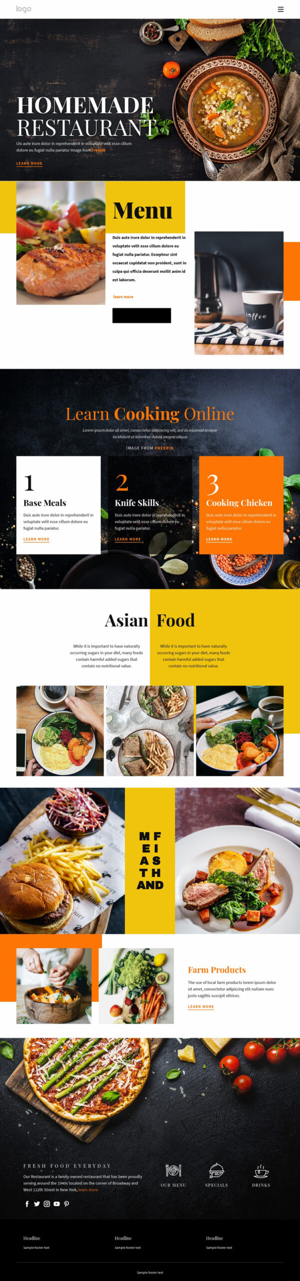
Food Website Design: Creating a Delicious Online Experience
A food website should do more than show what is on the menu. It should make visitors hungry, help them find the information they need and make it easy to take the next step, whether that is booking a table, placing an order or visiting a shop. Thoughtful food website design brings together strong visuals, clear content and a smooth experience across every device.
Start with the customer
Before choosing colours, fonts or photographs, consider who the website is for and what they need to do. A restaurant customer may want to check opening times, browse the menu and reserve a table. Someone ordering a celebration cake may be looking for flavours, prices, delivery details and customisation options.
Make the most important tasks easy to spot. Clear buttons such as “View menu”, “Book a table” or “Order online” help visitors move confidently through the site. Avoid cluttering every page with competing calls to action.
Use appetising, authentic photography
Food is naturally visual, so photography plays a central role in food website design. High-quality images can show the ingredients, presentation and atmosphere behind a food business. Use photographs that reflect what customers will actually receive, rather than relying entirely on generic stock imagery.
Images should be well lit and carefully composed, but they do not need to feel overly staged. A mix of dishes, people and behind-the-scenes moments can give the site warmth and personality. Optimise image file sizes so that pages load quickly, and add descriptive alternative text to support accessibility.
Make menus easy to read
A menu should be simple to browse on a phone as well as on a desktop. Whenever possible, present menu items as text on the page instead of relying solely on an image or downloadable PDF. Text is easier to read, search and update, and it can be more accessible to visitors using assistive technology.
Organise dishes into clear sections and include useful details such as prices, portion sizes and dietary information. Use consistent labels for vegetarian, vegan, gluten-free and other options, taking care to explain any relevant limitations. If menus change seasonally, make sure the online version is kept up to date.
Design for mobile first
Many people look for places to eat while they are out and about. A food website should therefore work smoothly on smaller screens, with readable text, easy-to-tap buttons and navigation that does not require pinching or zooming.
Important information should be quick to find. Display opening hours, location and contact details clearly, and make phone numbers tappable. For restaurants, connect the booking journey directly to a reservation system. For food shops and delivery businesses, keep the route from product discovery to checkout straightforward.
Build trust with practical information
Visitors often need reassurance before making a booking or purchase. Include accurate opening hours, a full address, clear delivery or collection details and up-to-date contact information. Customer reviews, awards and short testimonials can also help, provided they are genuine and presented appropriately.
For online ordering, explain delivery areas, fees, payment methods and expected times before the customer reaches checkout. Clear information helps prevent frustration and makes the business feel more dependable.
Keep accessibility and speed in mind
An effective website is usable by as many people as possible. Use strong colour contrast, descriptive headings, clear link text and forms that are easy to understand. Do not use colour alone to communicate dietary information or important notices. Make sure the site can be navigated using a keyboard.
Speed matters, too. Large photographs, unnecessary animations and complex scripts can slow pages down, particularly on mobile connections. Compress images, keep page layouts focused and test the website on different devices and browsers.
Help local customers find you
Search engine optimisation (SEO) can help people discover a food business when they search for restaurants, cafés, bakeries or food delivery in their area. Use accurate page titles and headings, describe the business and its location naturally, and keep the address and opening hours consistent across the website and relevant listings.
Dedicated pages for key services or locations can be useful when they provide genuinely helpful information. Avoid repeating keywords unnaturally; clear, useful content is better for both visitors and search engines.
A website that brings people to the table
Great food website design combines appetite appeal with practical detail. Strong photography attracts attention, clear menus answer questions, and simple booking or ordering tools make it easy to act. By focusing on visitors’ needs, accessibility and mobile usability, a food business can create an online experience that feels as welcoming as the food itself.
8 Essential Tips for Designing an Enticing Food Website
- Use high-quality food photography.
- Choose a warm, appetising colour palette.
- Keep menus clear and easy to scan.
- Make opening hours and location easy to find.
- Show prices and dietary details clearly.
- Ensure the site works well on mobile.
- Use readable fonts and strong contrast.
- Make online ordering quick and simple.
Use high-quality food photography.
Use high-quality food photography to make your website more inviting and help visitors imagine the flavours, textures and experience you offer. Choose clear, well-lit images that accurately represent your dishes, and use a consistent style that reflects your brand. Authentic photographs of your food, team or setting can feel more personal than generic stock images. Optimise image files so pages load quickly, and add descriptive alternative text to make them more accessible.
Choose a warm, appetising colour palette.
Choose a warm, appetising colour palette to make your food website feel inviting and reflect the character of your business. Rich reds, burnt oranges, golden yellows and earthy greens can suggest freshness, comfort and flavour, while softer neutral backgrounds help food photography stand out. Use colours consistently across buttons, headings and page details, and make sure there is enough contrast for text to remain easy to read.
Keep menus clear and easy to scan.
Keep menus clear and easy to scan by grouping dishes into familiar sections, using readable typography and displaying prices consistently. Include concise descriptions that highlight key ingredients, and make dietary options easy to identify with clear labels. Present the menu as text on the page rather than only as an image or PDF, so it works better on mobile, is easier to update and is more accessible to visitors.
Make opening hours and location easy to find.
Make your opening hours and location easy to find on every device. Visitors often check these details when deciding whether to visit, so display them clearly in your website header, contact page or footer. Include your full address, a map or directions, and any important information such as bank holiday hours or nearby parking. On mobile, make the address easy to open in a maps app and the phone number easy to tap.
Show prices and dietary details clearly.
Show prices and dietary details clearly so visitors can choose with confidence. List prices beside each dish, using a consistent format, and make dietary information—such as vegetarian, vegan, gluten-free or allergen content—easy to find and understand. Clear, accurate details help customers plan their meal, avoid surprises and feel more comfortable ordering.
Ensure the site works well on mobile.
Ensure your food website works smoothly on mobile, as many customers will browse menus, check opening times or place orders while on the go. Use readable text, simple navigation and buttons that are easy to tap, and make key details such as your menu, address and contact information quick to find. A fast-loading, mobile-friendly site makes it easier for customers to choose your business and complete a booking or order.
Use readable fonts and strong contrast.
Use clear, readable fonts and strong colour contrast to make your food website comfortable for everyone to use. Choose simple typefaces for menus and important details, and make sure text stands out clearly against its background. This is especially important for prices, dietary information, opening hours and booking buttons, which visitors should be able to find and read at a glance.
Make online ordering quick and simple.
Make online ordering quick and simple by keeping the process clear from the moment customers choose a dish to the final confirmation. Use an easy-to-browse menu, show prices and delivery or collection details upfront, and avoid asking for information you do not need. A mobile-friendly checkout, familiar payment options and a clear order summary can reduce friction and help customers complete their purchase with confidence.
